In September 2001, "Calligraphic Type Design in the Digital Age: An Exhibition in Honor of the Contributions of Hermann and Gudrun Zapf" was held in the Skylight Gallery of the San Francisco Public Library. The Zapfs and fourteen other designers exhibited their type designs to demonstrate the influence of calligraphy on contemporary type production. Susie Taylor, curator of the Harrison Collection of Calligraphy -- and herself a calligrapher-- wrote the following as an introduction to the catalogue that accompanied the exhibition. Here, she describes the long association of the Zapfs with the Bay Area book arts community and the SFPL's Book Arts & Special Collections Center.
 click to enlarge
 As much as anything else, the exhibition "Calligraphic Type Design in the Digital Age," is about relationships – relationships between people, and relationships that people have with letters and their forms. It is about a husband and a wife, Hermann Zapf and Gudrun Zapf von Hesse, and their work as type designers and calligraphers. It is about a generation of type designers working today who acknowledge the example and influence of the Zapfs, and for whom calligraphy is a meaningful inspiration in the design of new types. In a larger sense, it is about the large number of people interested in calligraphic type design: they are calligraphers, graphic designers, artists, typophiles, bibliophiles, and others who care about the aesthetics of the written or printed word. And it is about friendships: the friendships of colleagues, of students and teachers, patrons and artists. Perhaps it is these friendships that are most telling in the exhibition.
I am a calligrapher as well as curator of a calligraphy collection in a public library. My first real introduction to the Zapfs began in 1977. I had just started working in the Special Collections Department of the San Francisco Public Library. In November 1977, the Library, with the Friends of Calligraphy (FOC), hosted Hallmark Card's traveling exhibition of Hermann Zapf's work. Anne Englund, the librarian who then headed Special Collections, arranged this. It was a heady experience when we opened the packing boxes to discover the rich variety of calligraphic and typographic works. The show was large and filled the library's exhibition spaces on two floors. One of the exhibition events included a panel discussion about Professor Zapf's work by Jack Stauffacher, Adrian Wilson, Theo Jung, Andrew Hoyem and Sumner Stone. These men – all respected professionals in fine printing, book design, calligraphy or type design -- gathered to talk about the man whose work was displayed. This, to me, underscored the regard in which Hermann Zapf was held by his peers.
 Two engraved metal printing plates for Pen and Graver
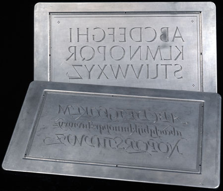
Roman Capitals and Humanistic Cursive
Calligraphy by Hermann Zapf, cut in metal by August Rosenberger, punchcutter
at D. Stempel AG typefoundry
San Francisco Public Library
5.75 x 10.25 inches.
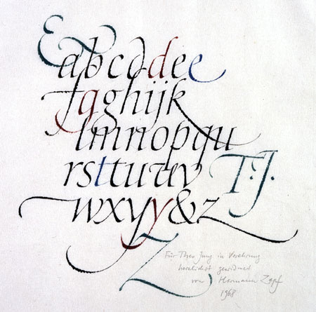
But long before the 1977 exhibition at the Library, I knew something about Hermann Zapf's work. I had begun to do calligraphy in 1969. Then, I took private lessons from Byron J. Macdonald, the San Francisco lettering artist. The lessons were held in his offices on Kearney Street, where he maintained a lettering studio. One day, I noticed a poster hanging on the studio wall. It was Hermann Zapf's 1959 pen drawn alphabet of large roman majuscules in asymmetrically arranged lines, surrounded by quotations written in roman minuscule, italic, blackletter, and Greek. I distinctly remember a sense of electric connection, of discovery at seeing such beautiful writing, so perfectly executed, in a strong, elegant design. It seemed to belong to another, and higher, order of accomplishment.
In those years it was not so easy to find one's way to the best sources of study. I was fortunate to be able to take lessons with Byron Macdonald, who was a gifted and accomplished scribe. As well as teaching me directly, he pointed me in a certain direction, and I began to find my way to those sources that most inspired me. Over time, I found that it was the work of Hermann Zapf that most drew my eye. I kept coming back to examples of his calligraphy, with its beautiful, if challenging, forms, so sophisticated in their proportions and details, displaying their lineage of the best of the classic scripts. Like many others before and since, I became enamored of the work of Hermann Zapf. To me, it set a kind of standard to which I should aspire.
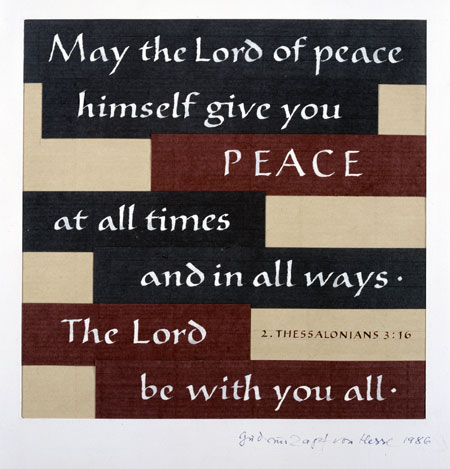
 click to enlarge
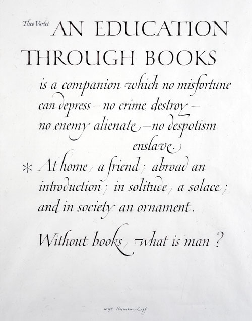
Working with the calligraphy and printing history materials in Special Collections, I had many more resources for study. Again, the work of Hermann Zapf exerted its attraction on me. Besides his printed publications, the Library owns two rare examples of original Zapf calligraphy: "An Education Through Books," commissioned by William Holman, and an informal alphabet presented by Professor Zapf to the late Theo Jung, the book designer. Jung was the source for many of the Zapf items in the Library collections – books, type specimens, prints, even hand written correspondence. In showing these to library patrons, I had the opportunity to study them and, not infrequently, to learn more through discussions with persons more knowledgeable than myself. As I began to learn more about typography, I took notice of the work of Gudrun Zapf von Hesse, who was not then as well known as her husband, but whose typefaces were often to be found in his books and typographic specimens. The specimen pages of Diotima from Libor Librorum, seen in this exhibition, were a happy discovery. I also remember finding a small catalogue illustrated with examples of her bookbinding, from a rare joint exhibition with her husband, held in Stockholm in 1952.
The 1970s and 1980s also saw a popular rise of interest in calligraphy. Calligraphy societies formed in major cities across the United States. Teachers of prominence -- American, English and European -- traveled from city to city offering seminars and classes. Communication between the local societies increased rapidly as a result, and it wasn't long before national calligraphy conferences became an annual event in different locations each year. Many new books on the subject were published, and calligraphic instruction even found its way to the television screen.
The impetus to seek instruction directly from Professor Zapf was strong. He had taught calligraphy at one time in Germany, at the Werkkunstschule Offenbach. And he had instructed lettering artists at Hallmark Cards in Kansas City, Missouri. Although he was not involved in the popular activities sponsored by the American calligraphy societies, it was possible to apply to attend the summer courses he taught at the Rochester Institute of Technology (RIT), in Rochester, New York. I first heard about the program in 1978, from Terry McGrath, who had attended the very first session. However, I had to wait until 1982, when I traveled to Rochester with my friend and fellow calligrapher John Prestianni, to attend Professor Zapf's calligraphy course.
 click to enlarge
 Whatever trepidation we had about studying with Professor Zapf was quickly dispelled by his friendly and courteous demeanor and his obvious respect and love for his subject. Always there was an atmosphere of collegiality in the classroom, as Professor Zapf lectured, demonstrated and answered the many questions from students. We studied formal Roman majuscules and other hands. Professor Zapf would go from student to student offering individual instruction and demonstration. He shared his working methods freely. Some of these "tips and tricks" (as he called them) are recorded in my class notes and include the following: use a small, stiff haired artist's brush to barely fill the nib of the pen with hand ground sumi stick ink, because the stiff bristles will clean the nib of drying ink while filling it with fresh ink; don't use paper that is too smooth, the pen needs a little resistance from the paper to produce sharp strokes; write with varied pressure to create tapered strokes; hold the pen up at a very steep angle for better control, especially when writing small letters; when retouching calligraphy with white gouache, match the white pigment exactly to the color of the paper so it can't be seen; in making serifs on Roman letters, use only one prong of the nib, working quickly, or use a smaller nib size.
Of equal if not greater significance was Professor Zapf's fundamental attitude about writing and working. This became apparent as the course progressed. It was often summed up in simple but telling statements. His seemingly simple proposition, "Do it all nicely from the beginning – everything" made me realize the importance of taking seriously all the various steps involved in producing calligraphy. I remember his caution about the study of historic letterforms, and the importance of using such models mainly for inspiration. One should not copy them precisely, because the world and time in which they were created is so different from our own. A slavish imitation of historic forms cannot answer today's needs.
In 1983, John and I returned to take the typography course. This was a comprehensive treatment of historic forms, contemporary methods, and issues on the subject of the design and use of type. The class was small, and all of us spent much time together, talking about calligraphy and type, and the examples Professor Zapf spoke of in his lectures. We were frequently to be found in the Cary Library, where librarian David Pankow and Professor Zapf together presented many treasures. And there was time for recreational activity. I will never forget a class outing we took one weekend, when the rodeo came to Rochester.
 click to enlarge
 Many friendships resulted from the courses at Rochester. There remains a bond of shared experience with others who attended: from the San Francisco Bay Area, including Georgia Deaver, Claude Dieterich, Linnea Lundquist, and Terry McGrath; and with calligraphers from all over the country, among them Julian Waters, Jerry Kelly, Marcy Robinson, and John Stevens.
In the following years, we again met Professor Zapf, and were introduced to Gudrun Zapf von Hesse, when the couple visited San Francisco. The Zapfs numbered several friends here, including Jack Stauffacher and the late Adrian Wilson. The most memorable encounter was a Sunday in 1983. We spent an afternoon in Special Collections with the Zapfs and their hosts Adrian and Joyce Wilson, examining highlights of the collection. It was a privilege to be included in their conversation about the past and present of typography and book design. I recall that Professor Zapf raised an issue relating to modern type design by comparing the grid system used at that time to an illustration in Albrecht Durer's treatise on lettering, of 1525. Following that visit, and continuing to this time, the Zapfs have honored the Library with generous donations of books, prints and other examples of their work, many of which would otherwise be unobtainable.
In 1984, Professor Zapf was made an Honorary Member of the Friends of Calligraphy. The Honorary Membership was awarded as an expression of respect and esteem for his accomplishments over a lifetime dedicated to beautiful letters. The text of the Friends' letter to him on this occasion reads, in part: "The excellence of your calligraphy serves to inspire, and awakens in our own minds and hearts a greater understanding, appreciation and love of letters."
This exhibition was conceived to honor both Hermann Zapf and Gudrun Zapf von Hesse. To mark the event, the Friends of Calligraphy has conferred a Lifetime Achievement Award to both of the Zapfs, for the inspiration and example they have given to others throughout their careers.
The first proposal for "Calligraphic Type Design in the Digital Age" was made in September 1999, during an FOC planning meeting. Linnea Lundquist– type designer, calligrapher, and former student of Professor Zapf at RIT – suggested a joint exhibition by Professor Zapf and Gudrun Zapf von Hesse, to demonstrate the connection between calligraphy and type design, to be held at the San Francisco Public Library. Other type designers would also invited to participate, to show how this connection has motivated others, especially in the last decade. A lecture series was also planned, to run concurrently with the exhibition. The Friends sent an invitation to the Zapfs in the spring of 2000. The Zapfs responded by accepting our proposal, saying, in part, that the suggestion of coming to San Francisco for a joint exhibition "is so unusual that we can't say no." It must be noted what a pleasure it has been to work with the Zapfs to produce the exhibition and to enjoy their support, encouragement, and enthusiasm for our plans.
 click to enlarge
 An invitation to participate was issued to the fourteen other type designers in the exhibition, each of whom accepted the invitation to share their work to honor the Zapfs. They are: Alan Blackman, Erik van Blokland, Rick Cusick, Timothy Donaldson, Jean Evans, Phill Grimshaw, Cynthia Hollandsworth, Akira Kobayashi, Richard Lipton, Jacqueline Sakwa, Robert Slimbach, Viktor Solt-Bittner, Jovica Veljovic, and Julian Waters. Each designer was asked to provide a specimen of a selected typeface, any background and developmental material if available, examples of an application of the type, and one of their calligraphic works.
Linnea Lundquist volunteered to chair the Zapfest, as the project was dubbed. Linnea also assumed the task of curating the exhibition, with the help of Sumner Stone and myself. Many others from the Friends and other San Francisco Bay Area book arts groups joined to work on organizing committees. This catalogue was planned, to show selected works from the exhibition and to present articles by the Zapfs and others on calligraphy and calligraphic type design. The eminent book designer and fine printer Jack Stauffacher, who is also Professor Zapf's longtime friend and colleague, was invited to design the catalogue, with his fellow designer Laurie Szujewska. John Prestianni, a past editor of Alphabet, the Journal of the Friends of Calligraphy, volunteered his efforts to plan, edit and oversee the production.
Some words about the Friends of Calligraphy, the sponsor of this exhibition, are in order. The FOC is a non-profit organization founded in 1974 as a result of the renewed interest in calligraphy that took place in this country in the 1970s.
According to its by-laws, the purpose of the Friends is "to promote the study and practice of calligraphy, to encourage individual excellence, to foster a wider appreciation and deeper understanding of calligraphy, its history and applications." Activities have evolved over twenty-five years to include seminars and workshops, lectures, publishing and exhibitions. A dedicated corps of volunteers sustains these efforts.
The association between the FOC and the San Francisco Public Library led to its choice as the exhibition venue. The Library's Marjorie G. and Carl W. Stern Book Arts and Special Collections Center is a resource for the book arts community and for calligraphers. It is the location of two collections, the Richard Harrison Collection of Calligraphy and Lettering and the Grabhorn Collection on the History of Printing and the Development of the Book.
The Harrison Collection, begun as the private collection of San Francisco calligrapher Richard Harrison in the 1950s, features an international selection of contemporary calligraphy, manuscripts and printed works, including a collection of reference material. The accessibility of the collection in a public library prompts use by scribes, teachers and students. It is a destination for calligraphers from around the world.
The collection of San Francisco printer Robert Grabhorn forms the basis for the present collection on the history of the printed book. It contains early printed books, historic printers' manuals, a range of fine press books, printed ephemera and type specimens. The breadth of its reference collection attracts students of printing, papermaking and bookbinding.
It is therefore, most appropriate that "Calligraphic Type Design in the Digital Age" is held in the San Francisco Public Library. The exhibition confirms the place that beautiful letters have in written communications. And while it celebrates the successes of the recent past, it also illuminates the direction that letterforms will take in future years. In its creation, the exhibition has brought together many friends and colleagues to honor Hermann Zapf and Gudrun Zapf von Hesse, two individuals whose contributions have enriched the calligraphic and typographic traditions of our time. So many relationships - between teacher and student, typographer and typophile - are thereby affirmed and deepened. We are appreciative, and very grateful.
© 2001 by Susie Taylor, reprinted by permission of the author.
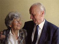
Gudrun Zapf von Hesse and Hermann Zapf
Photo by Jovica Veljović, June 2001