by Alastair Johnston
Since the Gold Rush, San Francisco has been a center not only of entrepreneurial spirit but also of publishing. Writers who had close ties to the press, like Gellett Burgess, Bret Harte, Robert Louis Stevenson, and Mark Twain, tarried here. Others, like Oscar Wilde and Ruydard Kipling, were charmed by the edginess of the Wild West that emanated from the saloons, the gold mines and even the cable cars. A second influx of prospectors for literary fame, in the early twentieth century, brought a community of fine printers that made the city a mecca for Independent and creative book artists. Notable among printers of the second wave were the Johnson brothers (two Australian natives who operated the Windsor Press), Johnck & Seeger, and Taylor & Taylor (sons of the poet Mayor of San Francisco Edward Robeson Taylor), whose principal, Henry Taylor, had been a student of D. B. Updike in the famous course at Harvard Business School out of which Updike's two-volume study Printing Types arose. (Incidentally two other San Francisco fine printers, James Johnson & Johnny Johnck, also studied with Updike and Dwiggins at Harvard.)
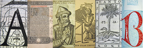
Two Midwesterners, the Grabhorn brothers -- Edwin and Robert -- turned out to be the most influential printers to appear on the San Francisco scene, the ostentatious presence of John Henry Nash notwithstanding. Arriving from Indiana in 1919 they quickly attracted a loyal clientele and survived the lean years of the Depression through the patronage of Albert Bender, Random House, and the Book Club of California. They made their mark by establishing the bibliophilic field of Californiana, producing works about the history and literature of their adopted state to keep their platens clanking. Their books were remarked for a western version of Bruce Rogers' allusive typography, wedding type and typography to subject. Among their most celebrated works are editions of Leaves of Grass [1] and The Travels of Sir John Mandeville [2] , printed in small editions for Random House in the 1920s in the darker types of Fred Goudy and the blackletter of Rudolf Koch.
Updike's scholarly influence extended across the continent, and Robert Grabhorn also came under his spell, studying his work for its opinionated discussion of historical types. Despite his obvious jealousy of the success of Updike's Merrymount Press of Boston, Grabhorn used Printing Types as a "shopping list" to find rare books on the history of printing. He discovered that many of the trade books on printing mentioned by Updike -- manuals and type specimens in particular -- were easily and cheaply obtained, and he caught the bug of collectimania, deciding to gather as many of those titles as he could. Once started on the path, he didn't stop until he had amassed one of the country's most impressive libraries on printing history, containing in addition superb examples of fine printing beginning with the great Italian and French presses of the sixteenth century, as well as examples of "experimental printing." In 1965 the bulk of Grabhorn's library was given to and purchased by the San Francisco Public Library; the balance came after his death from his widow, Jane (a remarkable printer herself), in 1973. The Grabhorn collection of 1,500 books (now expanded to over 10,000 books, 100 journals, and 35,000 pieces of ephemera) forms the core of the city's Book Arts & Special Collections Center, joining the important Harrison Collection of Calligraphy and Lettering and the Schmulowitz Collections of Wit and Humor (SCOWAH).
Grabhorn wrote a little essay about his collection shortly before his death, describing (in the third person) some of his triumphs as a book collector: “Although the Aldine Virgil of 1501, the first book to be printed in italic types, was far too celebrated to be within his reach, he was able to console himself with the Aldine Dante of 1502, [3] 'picked up' locally for $35.” He admits that "gloating comes easily to collectors," when describing some of the treasures he acquired cheaply during the Depression. The celebrated Medailles [4] of the Imprimerie Royale of 1702 (showing the innovative sharply engraved style of letters cut by Philippe Grandjean) was his for a mere $55, and he assiduously purchased incunables from the press of Erhard Ratdolt [5] (whom he called "the printer's printer"), including the 1483 Eusebius and the Elements of Euclid.
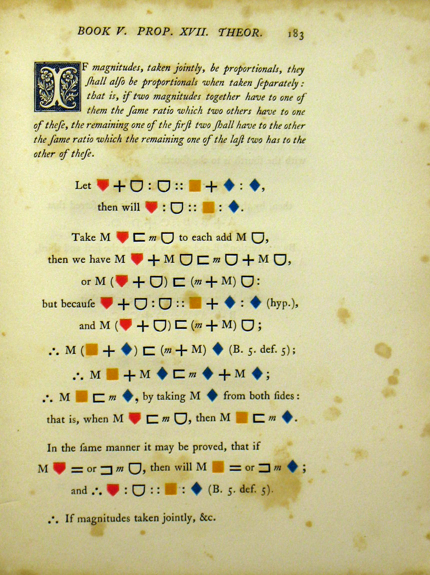
To go with this editio princeps he added the third and fourth editions of Euclid, printed in Venice; the seventeenth-century folio English edition edited by Elizabeth I's royal magician John Dee [6 & 7] (important for its articulation of type size and style for emphasis), and the beautiful colored edition of William Pickering, edited by Oliver Byrne [8 & 9] (London, 1847), that foreshadows abstract art of a century later.
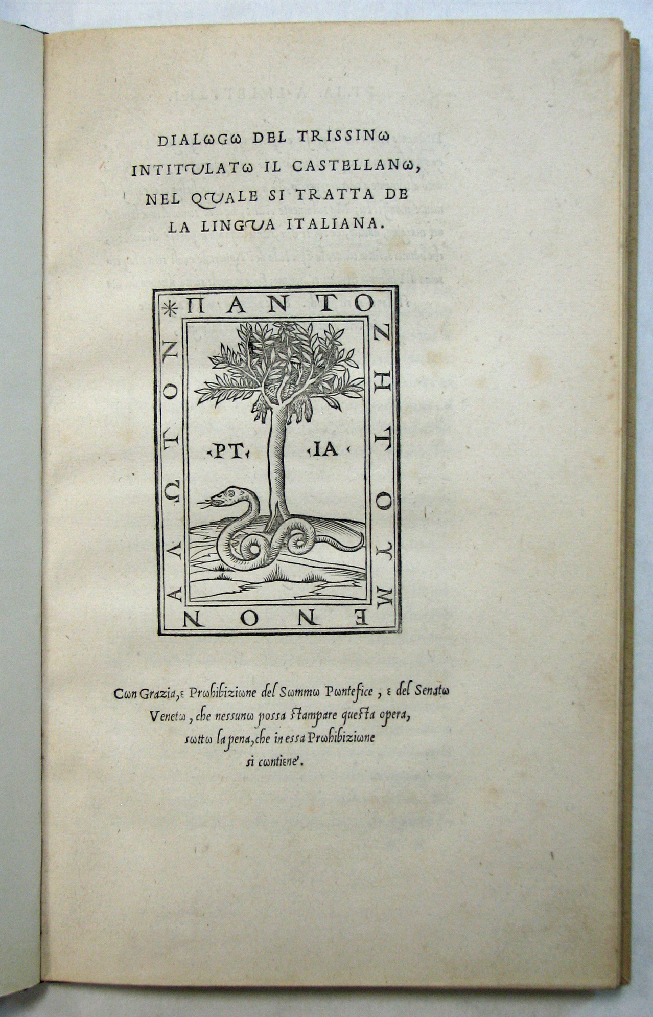
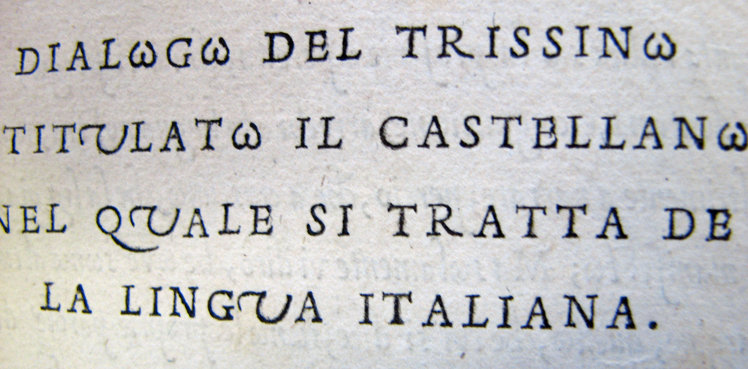
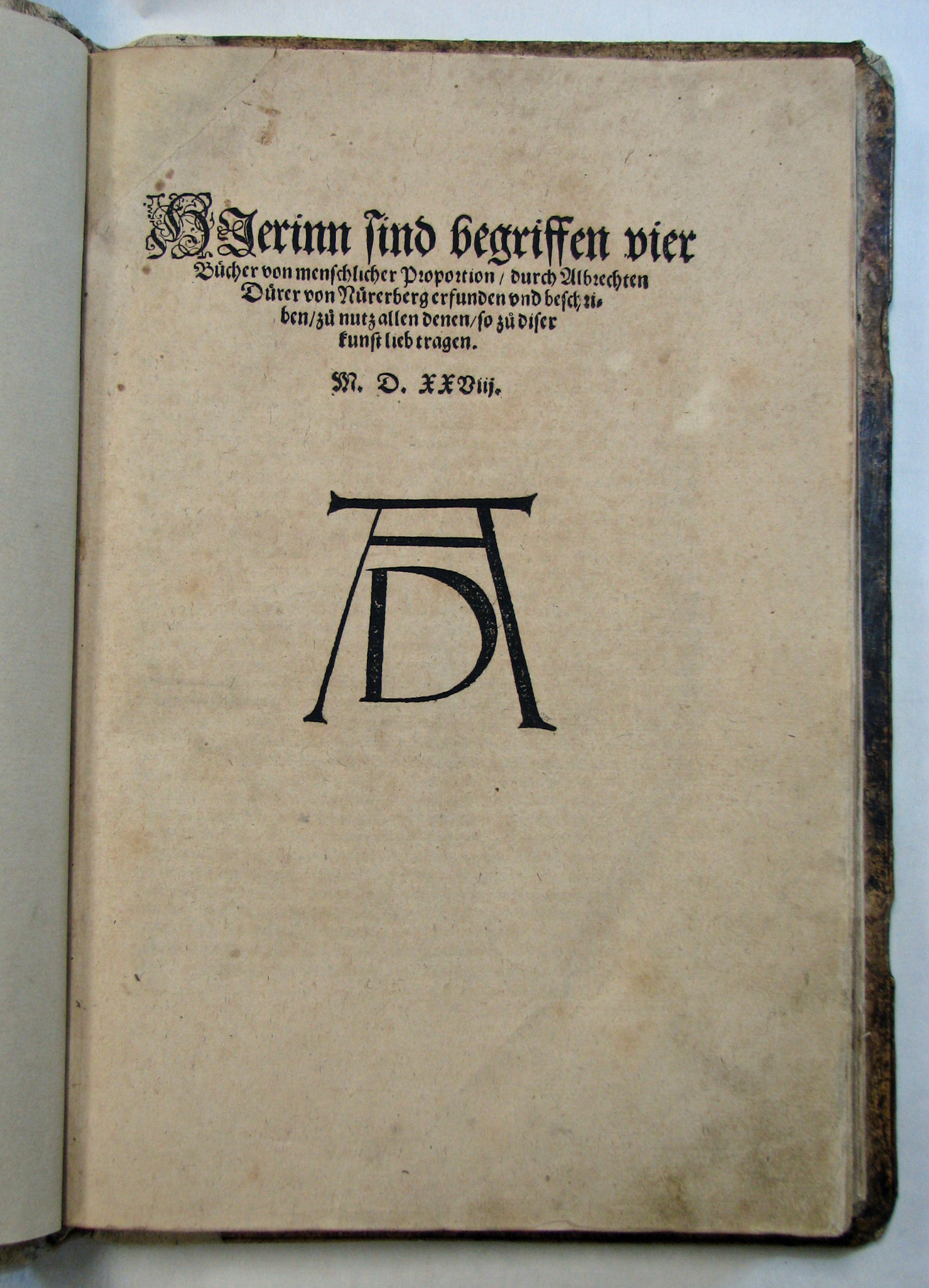
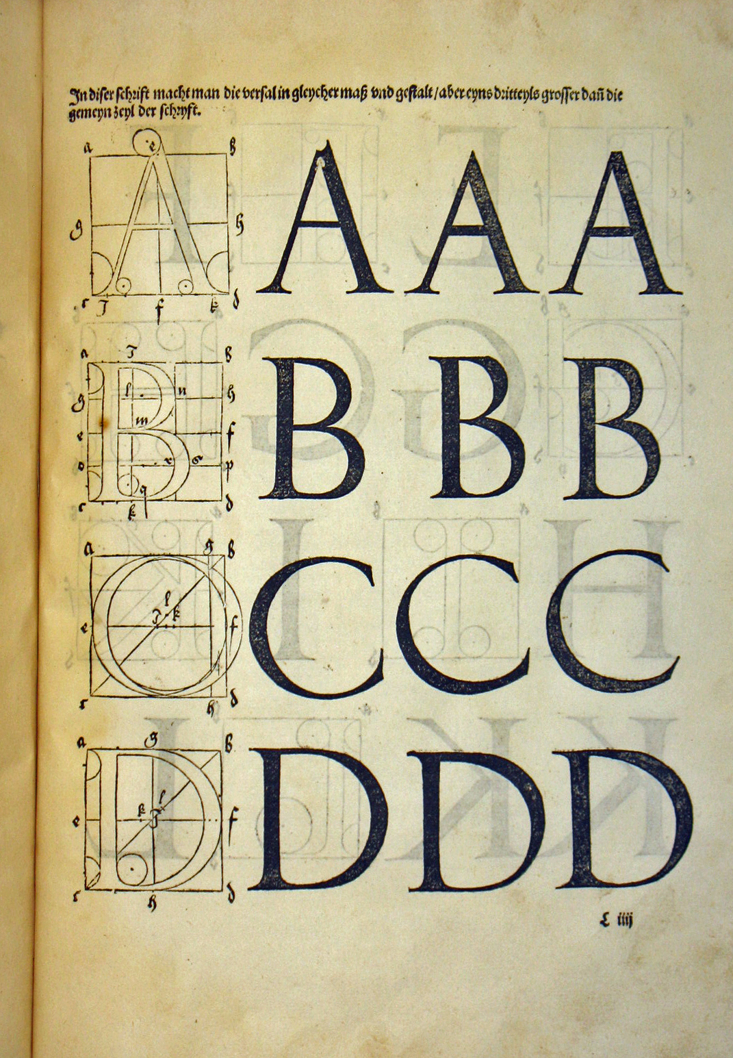
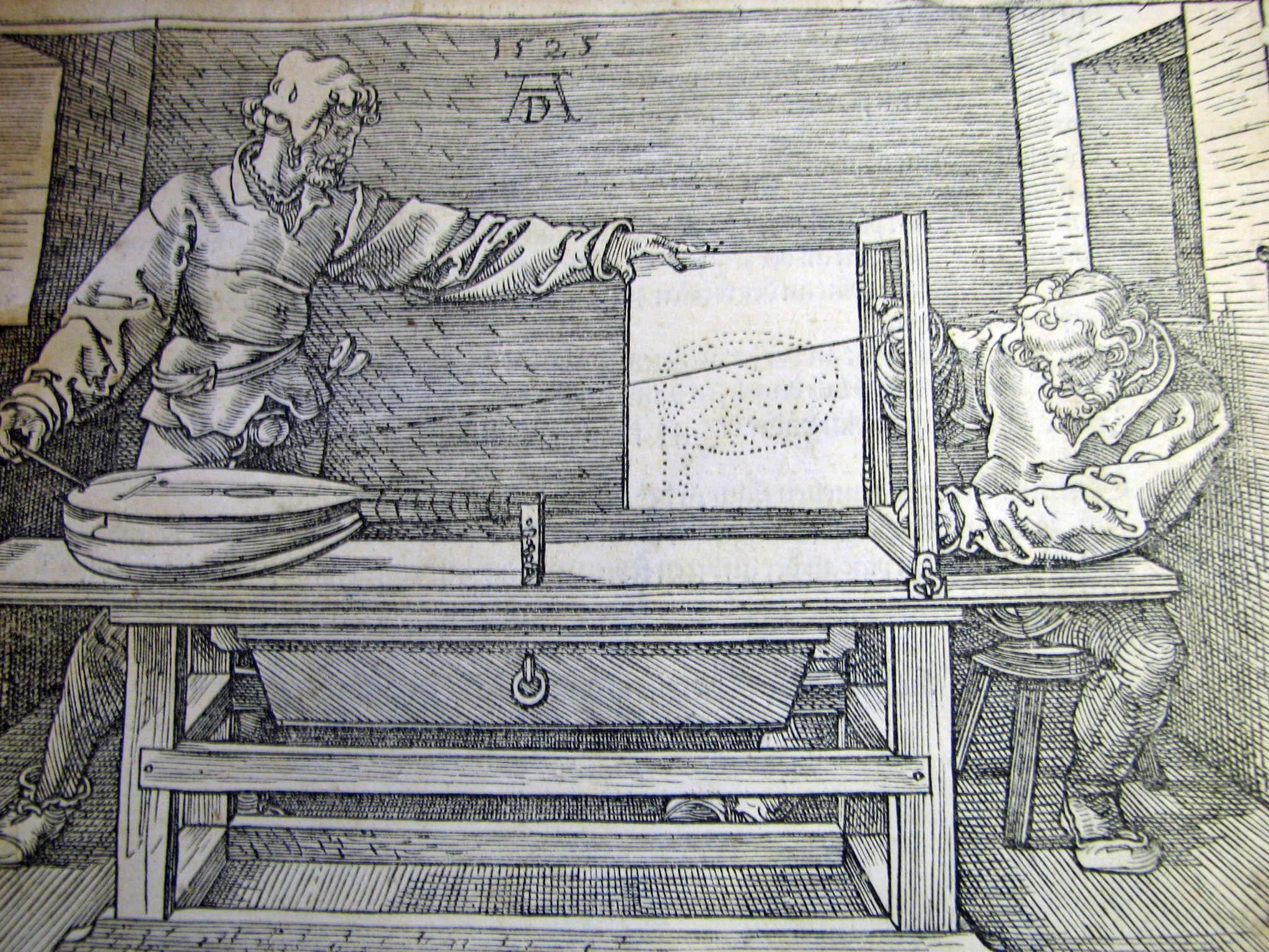
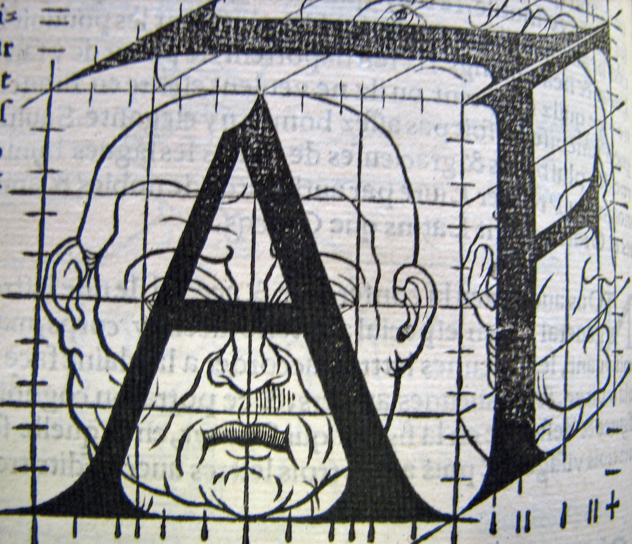
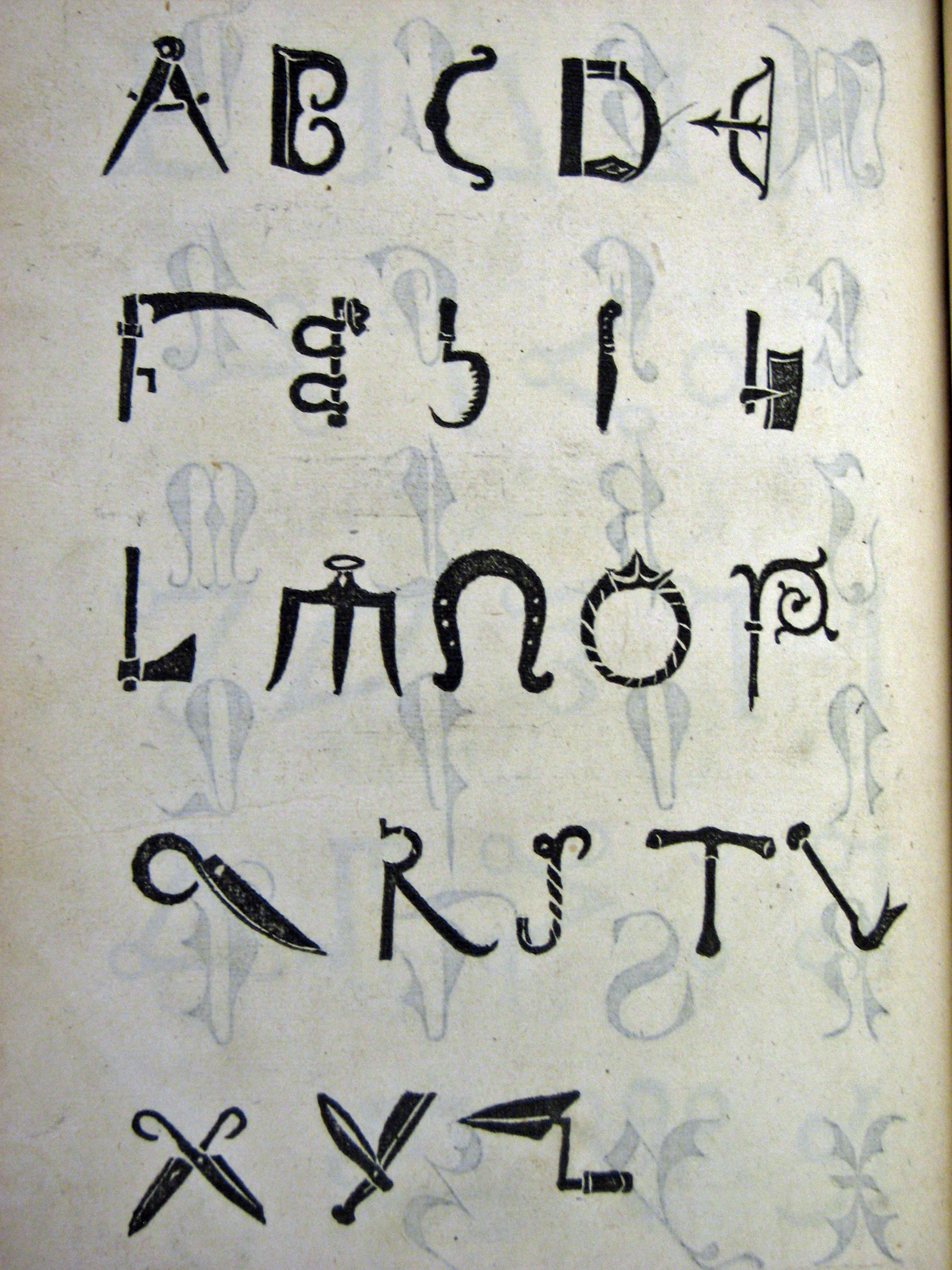
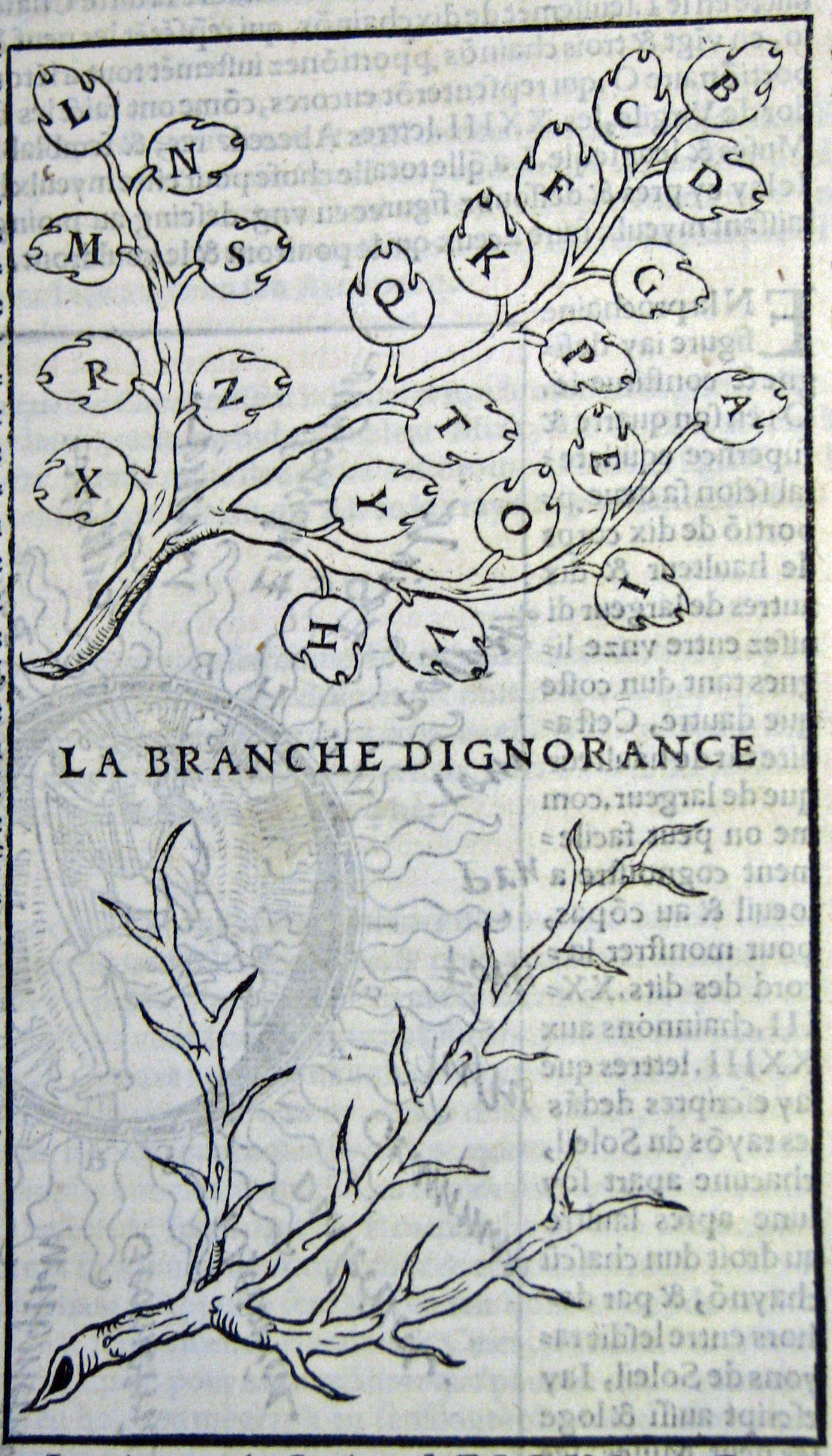
Grabhorn collected editions of orthographic reformer Gian Giorgio Trissino [10 &11] , including that with the first use of Arrighi's chancery type of 1524 (Trissino used Arrighi's Greek characters to distinguish between various Italian pronunciations of o, e & z; his suggestion to use j & v for consonantal i & u were eventually adopted). In addition to sought-after Estiennes, Grabhorn acquired the principal book works of Albrecht Dürer. Dürer may have learned the principles of perspective from Luca de Pacioli and brought them back as a souvenir of his trip to Bologna. A bit more lasting than a souvenir sausage, his knowledge led to a lifelong study and the publication of a major treatise on the art, Underweysung der Messung, 1525. [14] His Four Books of Human Proportion of 1528 include his fanciful adaptation of the roman alphabet from human forms. [12 & 13] Geofroy Tory's Champ Fleury of 1529 went a step further [15,16 & 17]
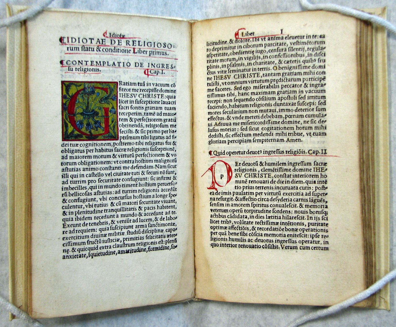
These latter two works share a belief in the derivation of the form of letters from human proportions. Tory believed all letters were based on I and O and brought in the Greek myth of Io to substantiate his ideas. But his real influence was in the wide acceptance of Roman letterforms over Gothic. A small group of books indicates milestones in the career of another great French printer, Simon de Colines. One of De Colines' earliest works, Raymond Jordan's Idiota de statu religiosorum [17a] of 1521 is printed in Venetian type and rubricated in the manner of manuscript books.
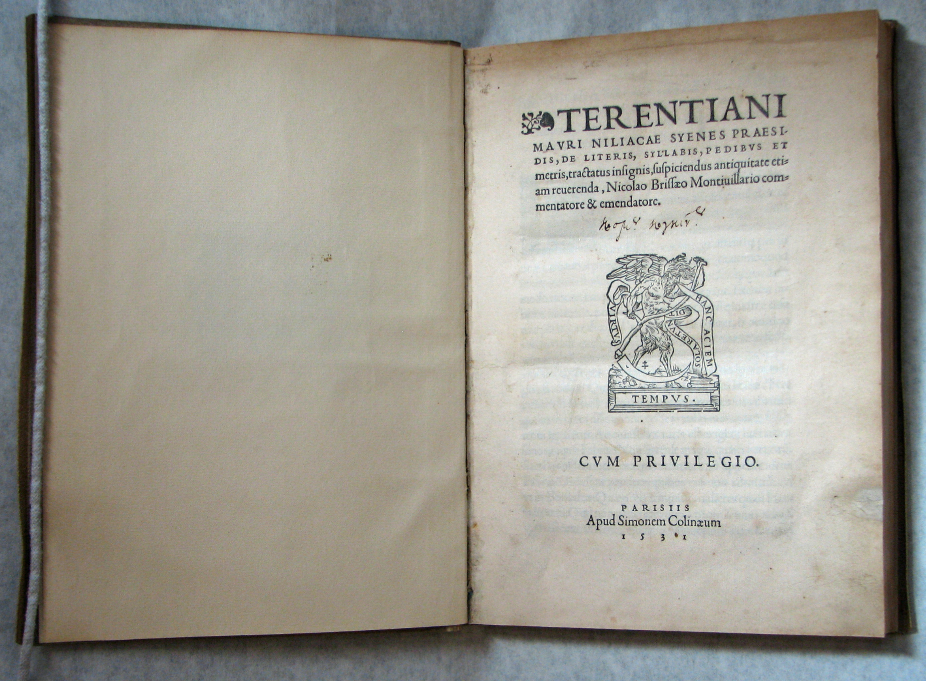
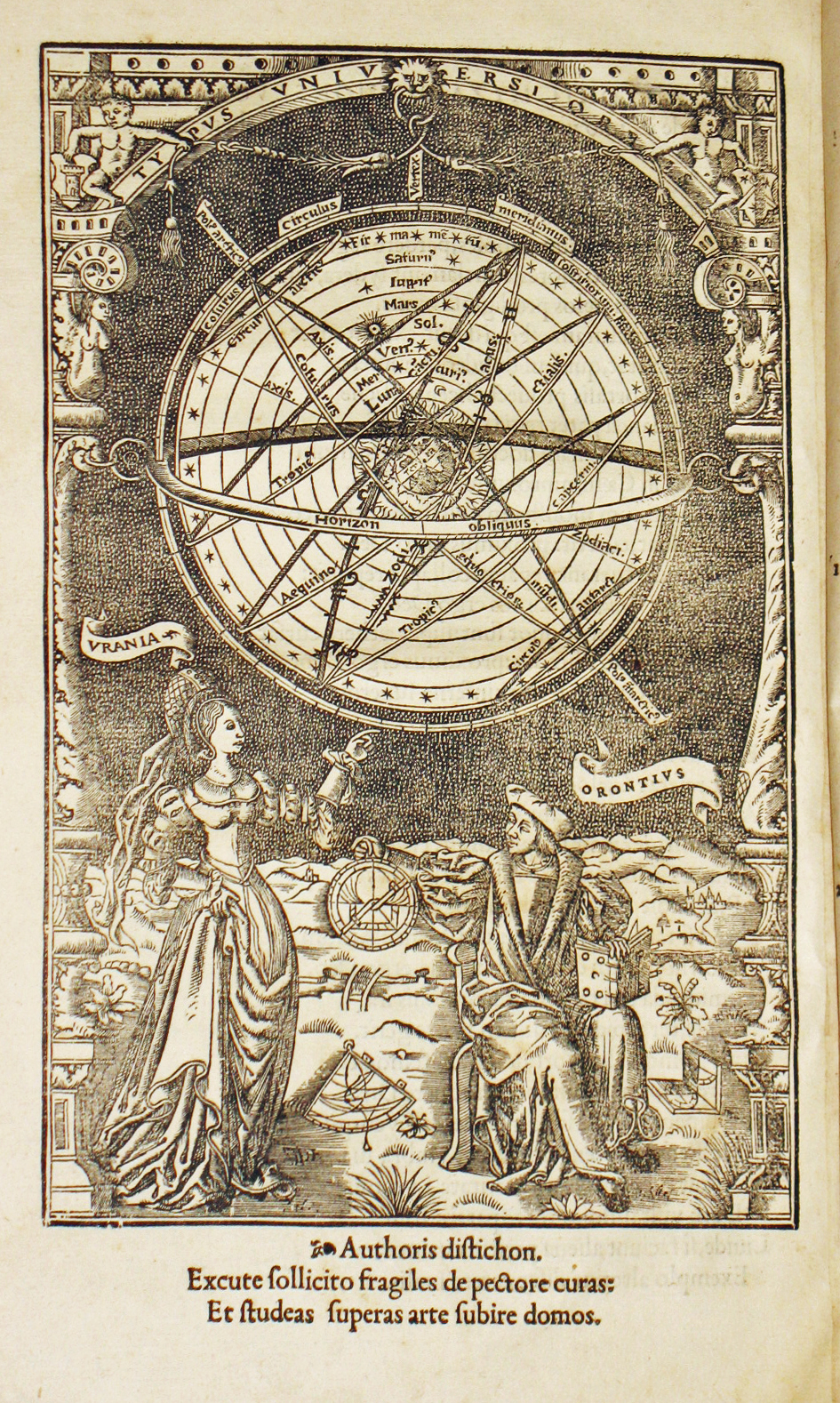
Grabhorn acquired British occultist and typography scholar Ellic Howe's beautiful copy of the 1531 Terentianus [18] in which De Colines showed off his elegant new gros romain type -- the full-fledged French roman, attributed to Garamont by Beatrice Warde, that supplanted the Venetian model. The types in it have now been attributed to the printer, Simon de Colines by Dr Vervliet, who calls it "a wholly satisfying typeface, one of the best to appear in the sixteenth century." This work, a second-century treatise on metrics that is composed in the various styles it discusses (hexameters, iambics, etc.), includes the famous pronouncement, in Latin, "Books have their fate, depending on the reader's perception." Another work, from the popularizer of science and royal professor of mathematics at the Sorbonne, Oronce Finé [19] , has wood engravings by the author including a lovely full-page self-portrait with a shapely Urania, the Greek muse of Astronomy. Other early science books in the library include Apian's Cosmographia [20] of 1548, a book with volvelles -- revolving circles of paper that help explain the astronomical principles expounded.
"But it is not just the high spots that make a collection," Grabhorn said in A Printer's Library. "An attempt has been made here to find experiments in printing, typographical curiosities, failures as well as successes. Examples include Joseph Manni's edition of Virgil in 1741 in which he successfully achieves the effect of an important manuscript in rustic capitals by using just three specially cut letters. Updike says of it: "[T]hus the work displays that amazing audacity at arriving at a striking effect, notwithstanding inaccurate details and economy of method, which was typical of Italian printing of the time." Conversely there is Philip Rusher's attempt to create a "new mode of printing" by eliminating all descending letters (q, p, g, etc.) and substituting capitals. This "improvement" stopped with Rasselas (1804) -- "a result more curious than beautiful." Dr Johnson's novel, set in Northeast Africa was a best-seller, which shows the patience of eighteenth-century readers: I found it impossible to read. To highlight the failings of Rusher's innovation, the word "Egypt," with its three descenders in a row, occurs frequently in the text.
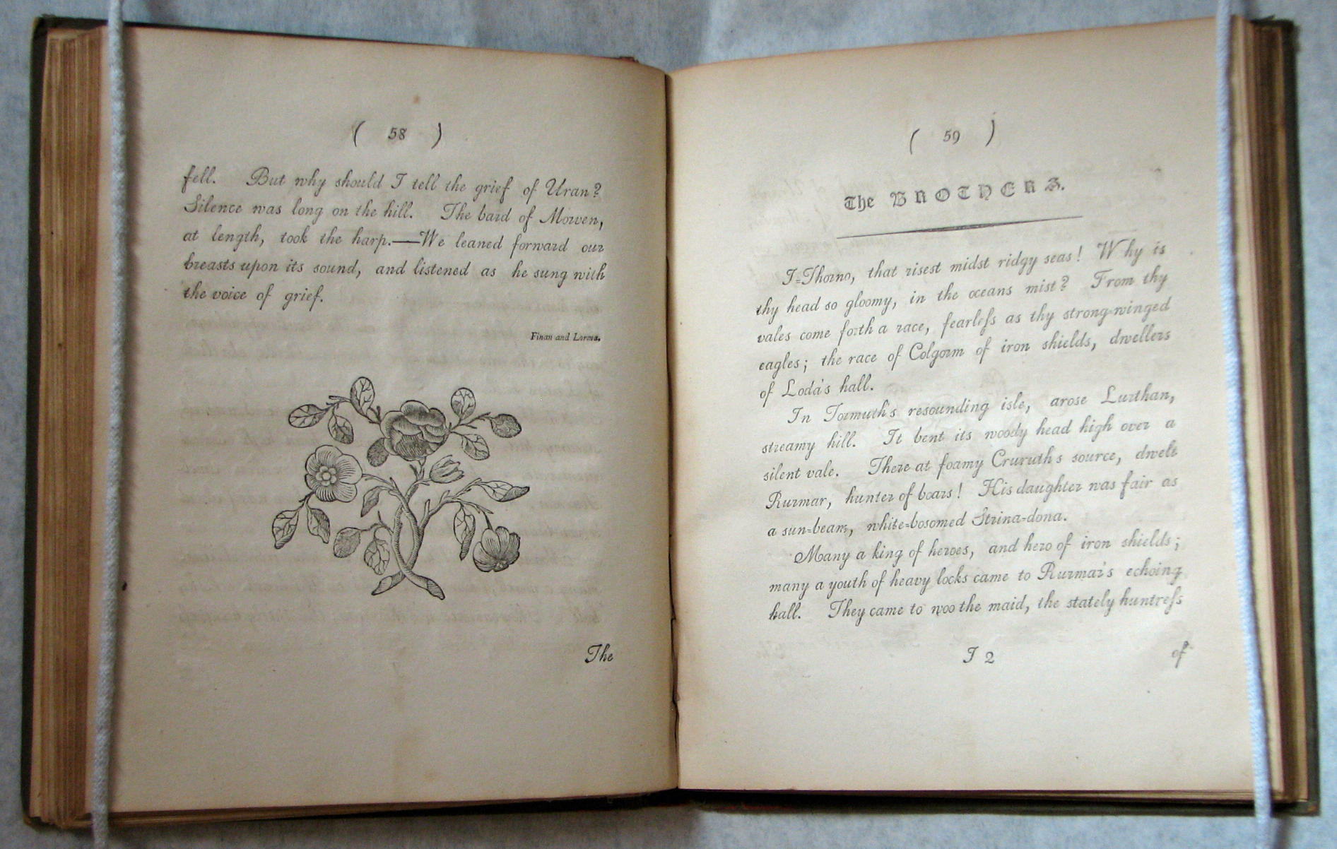
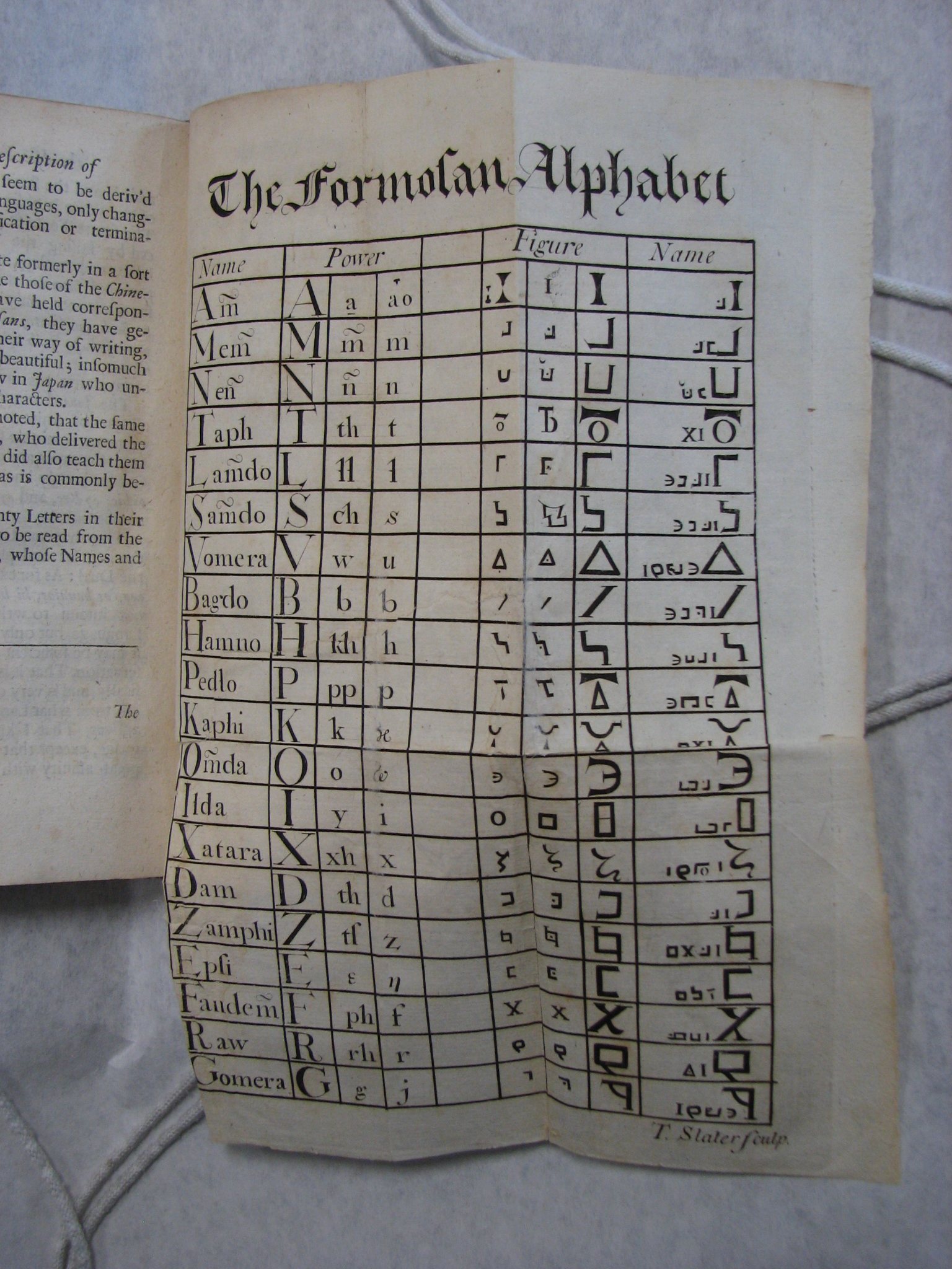
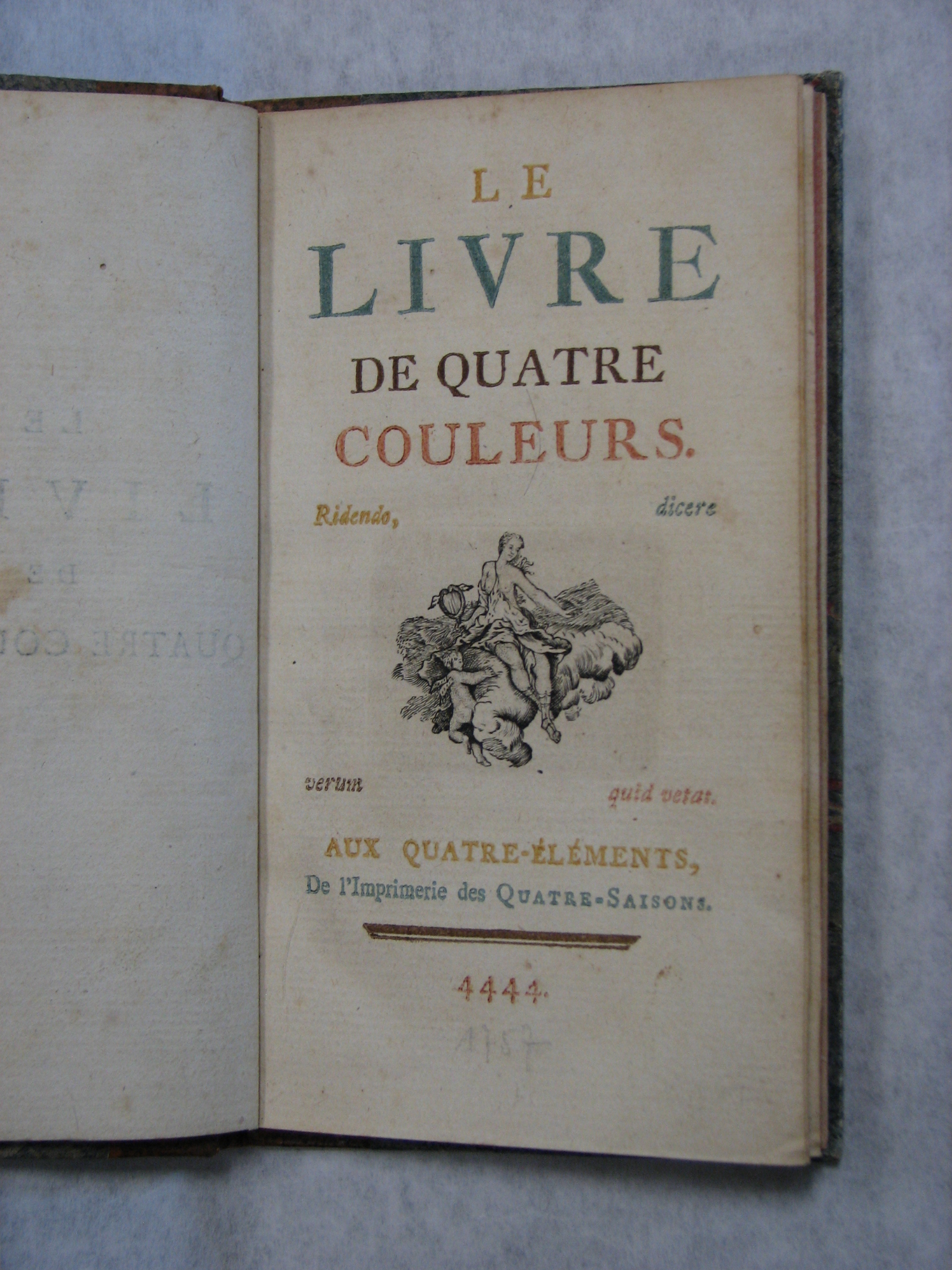
Among the other typographical curiosities are Valentin Haüy's Essai sur l'Education des Aveugles [21] , printed by Clousier, the King's Printer, in 1786. This book in embossed script type is not merely a precursor of Braille but a whole system for employing blind children in composition and job printing. Unfortunately the highly ornate letters -- a hybrid sans serif script -- are illegible, even to sighted readers. Another uncommon work in decorative script types is Mary Potter's 1789 Poetry of Nature [22] , a selection from the Caledonian Bards, which is a prose adaptation of McPherson's Ossian in an unusual layout (employing Caslon's ornaments and blackletter types, set in all-capitals), by J. P. Cooke of London. McPherson's poem, first published in 1760, which was said to be composed from oral tradition (like Homer's works), was wildly successful, but immediately Dr Johnson called it a hoax. Nevertheless, it is a great invention and joins George Psalamanazar's Description of Formosa (1704) [22a] as a creative work worthy of Borges. Grabhorn doesn't comment on his exquisite volumes by Louis-Antoine Caraccioli, Livre de Quatre Couleurs [22b] (1757, or year 4444) and Livre à la Mode (1759), printed in colored inks, nor Andrew Tuer's delightful Quads within Quads [23 & 24] , but there is no doubt he enjoyed them. With his collection one can easily take a standard text like Updike's Printing Types or S. H. Steinberg's Five Hundred Years of Printing and systematically find the illustrations. The early Spanish press is the only weak area.
Bill Holman (later of the Humanities Research Center at the University of Texas at Austin) was the City Librarian who helped Grabhorn find a good home for his library when the cares of old age included worrying about an irreplaceable collection of rare books in a city prone to earthquake and fire. The fate of Adolph Sutro's vast hoard of books, which was decimated in the 1906 fire, still haunts many bibliophilic reveries. (In fact the Bancroft, in the outer Mission past the creek at Army Street, was the only San Franciscan library that survived the fire.) Holman didn't know how to raise the funds to buy the collection outright, but, realizing the importance of it, he relied on the generosity of the Friends of the Library and, in addition, sent purchase orders through City Hall every month until the full amount had been paid. Holman knew it was an unorthodox approach but, he later recollected, he was young and reckless.
The Special Collections Department (as it was then known) already had notable holdings: The Max Kuhl bequest (which formed the core of the collection of fine press books) was a random assortment of bibliographic treasures including a twelfth-century New Testament [25] in Latin that had come from a German nunnery via the cornucopia of Sir Thomas Phillipps. Among the incunabula is a beautiful hand-colored Legenda Aurea (The Golden Legend of Jacobus de Voragine) from the press of Johann Bamler [26] (Augsburg, 1475), one of the best-sellers of the incunabular era. A large, marvelous group focusing on the prolific press of Aldus Manutius [27] , which flourished in Venice at the turn of the sixteenth century, accumulated by itself, as rare books sometimes do in great institutions. Aldus is most important for affordable and accurate editiones principes of the founding fathers of Western secular literature, the Greek writers Aristotle, Aristophanes, Plato, Aeschylus, Euripides and Sophocles. Plus he issued portable octavo editions of Roman authors like Catullus, Martial, Juvenal and Petronius and later Italian writers Dante and Petrarch. His 1501 Virgil introduced the pocket-book format as well as the first italic typeface, cut by Francesco Griffo. The Grabhorn collection also holds the 1502 piracy of Aldus' Martial, printed in Lyons, that initiated the spread of italic type across the Alps. As there was no copyright protection, Aldus introduced his famous dolphin and anchor pressmark as a kind of "Good Housekeeping Seal of Approval" on his works so buyers would know they were getting the genuine article and not a knock-off. There are many of these celebrated works in the collection, plus three copies of Aldus' popular coffee-table book, the Hypnerotomachia Poliphili [28], including the original (1499), the reprint of Paulus Manutius (1545), and a facsimile produced in 1904.
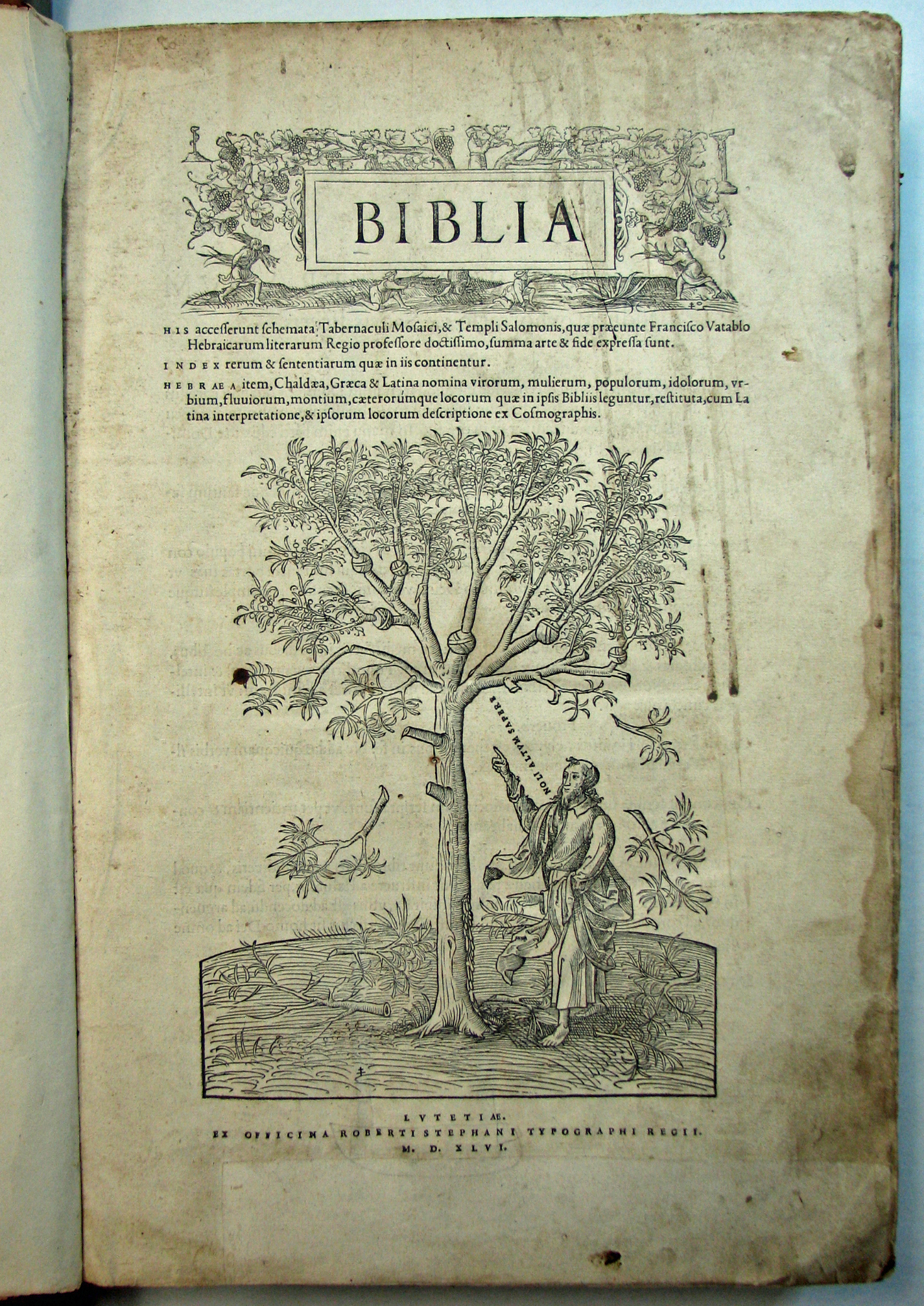
From the Estienne Press we note the magnificent Bible [29] of 1546 with its large woodcut illustrations and the use of large upper & lowercase display types, again long attributed to Claude Garamont, but now assigned to Maitre Constantin by Dr Vervliet. Their design was heralded as a revolution by Harry Carter, for introducing to transalpine Europe a "new fashion for lightness and delicacy." We are on surer ground for assigning the 1542 Estienne greeks to Garamont because a contract exists for producing these "Grecs du Roy," or Royal greek types. Like Griffo, Garamont economized by using roman capitals where they were the same as their greek counterparts but the font was encumbered by countless ligatures which were prone to breakage and a pain for the typesetters.
The Estiennes' famed works join a less well-known sixteenth-century book of Prodigies, printed by Petri of Basle, in 1557. Examples of fine press work dot the collection: Baskervilles rub shoulders with eighteenth-century pamphlets documenting scandals and trials (the National Enquirer of the time). In addition to the monumental Manuale of G. B. Bodoni from Grabhorn's library, there are examples of Bodoni's commissioned printing, including the wonderful Poems of Gray, from the Kuhl bequest, and Walpole's Castle of Otranto (the sixth edition, 1791), an early example of the Gothic horror story, which edition the author described as "too flawed to read." The large type on a narrow measure with huge margins is impressive but not conducive to reading; it reminds me of trying to ride your bicycle as slowly as possible without falling off.
Of course, the collection houses the work of San Francisco Bay Area printers, but among the surprises is a near-complete collection of the London-based Eragny Press [30 & 31] . The unusual productions of Lucien & Esther Pissarro's private press were Grabhorn's favorites among all the fine printing of the revival movement, and he waxed effusive on these delicate books and was inspired by the technical finesse manifest in them. Some are printed on vellum in closely registered colors from wood engravings.
Another memorial bequest was instituted in memory of book designer Jane Hart. George M. Fox's collection of early children's books, particularly noteworthy for their color printing using woodblocks, and a nice complement to the Grabhorn collection, followed. Papermaking and bookbinding are also represented, but the allied field most thoroughly represented is that of calligraphy.
The Richard Harrison Collection of Calligraphy and Lettering is a superb archive of original calligraphic work, including two block books of Rudolf Koch and a commissioned series of Shakespeare's Sonnets from well-known English calligraphers. In 1963, Holman commissioned Hermann Zapf to design a broadside celebrating calligraphy, which has been reproduced many times. The Harrison Collection holds many unique examples of calligraphy and books, from Edward Johnston and his school (including Graily Hewitt, Irene Wellington, Alfred Fairbank, and Ida Henstock, the famous gilder) to modern British exponents of the art like Marie Angel, Anne Hechle, and Donald Jackson, from Austrian masters like Friedrich Neugebauer, German stars like Zapf and Karlgeorg Hoefer, to prominent Eastern European scribes such as Jovica Veljovic and Leonid Pronenko. The collection actively acquires work; to balance the richness of European examples, the focus has lately been on the current generation of American calligraphers, artists like Thomas Ingmire, Sumner Stone, Georgia Deaver, David Meckelburg, Georgianna Greenwood, and John Stevens. The Harrison Collection also dovetails nicely into the Grabhorn Collection.
There are other notable aspects of the San Francisco Special Collections. The personal papers of the longshoreman-philosopher Eric Hoffer came in 1963. There is a Robert Frost archive, a Sherlock Holmes collection, and a collection on the Panama-Pacific Exposition that came from Norman Strouse. And every April Fool's Day the library exhibits part of the Schmulowitz Collection of Wit and Humor (a staggering 22,000 volumes in thirty-six languages), which also provides for continuing acquisition of humorous books and periodicals.
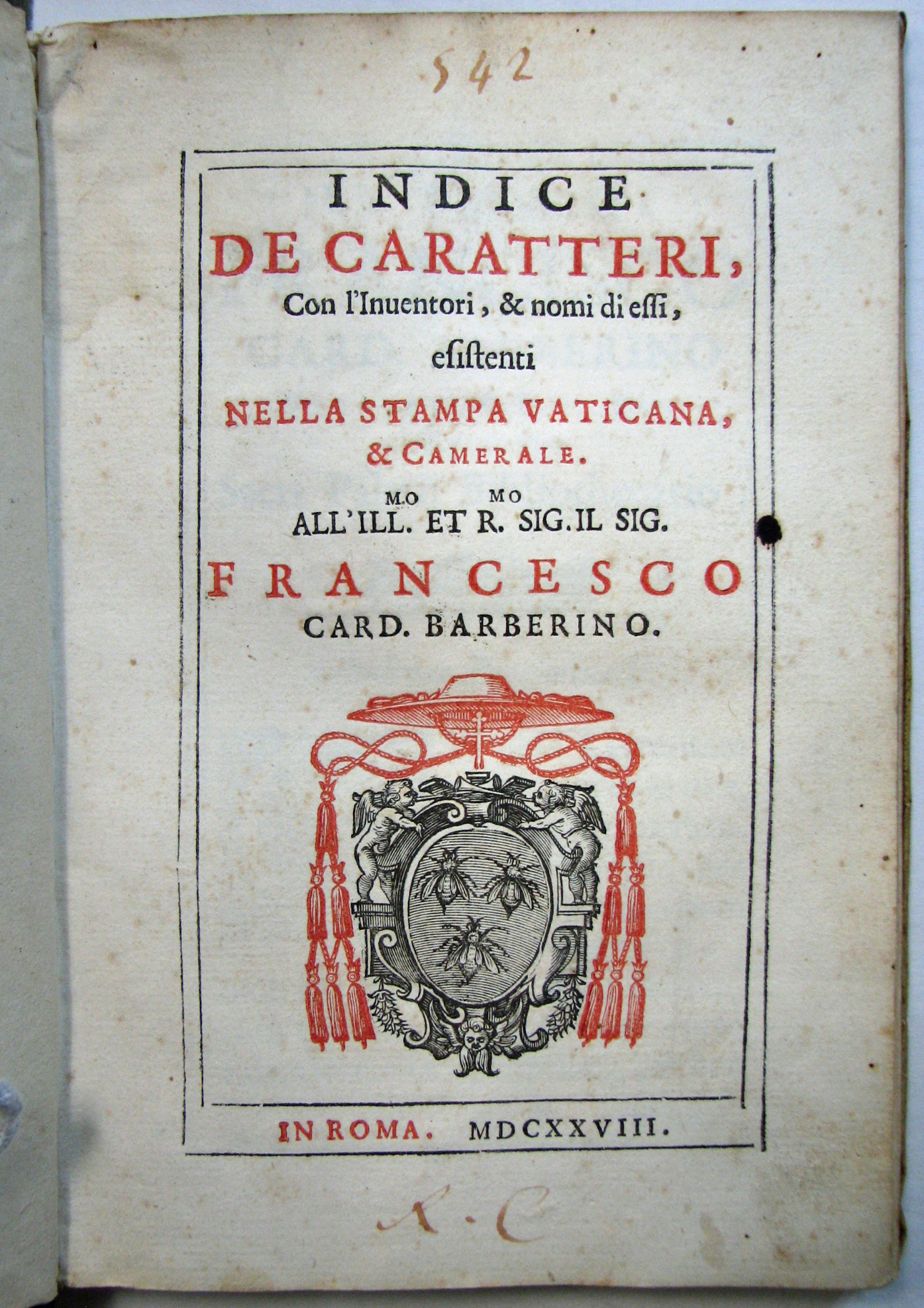
Robert Grabhorn jotted down a list of the most significant type specimen books he owned, starting with the 1628 Vatican specimen [32] (one of the earliest specimen books) and added Propaganda Fide, Rome 1629; Endters [33] , Nuremberg 1721; Caslon [34], London 1734; Luce, Paris 1740; Fournier [36] , Paris 1764; Enschedé [37] , Haarlem 1768; Bodoni [38] , Parma 1818; Didot [39] , Paris 1819; Dickinson [40] , Boston 1856."
With these few notes he covers a rich spectrum of history and the development of printing type from the culmination of Renaissance craftsmanship in the exotics of Robert Granjon to what Updike termed "Didotschen rubbish" and the beginning of Victorian excess.
Robert Granjon cut some of the Jesuits' type, including the Arabics, at the end of his life. He was summoned to Rome by Pope Gregory XIII in 1580, and, though he was undoubtedly a Protestant, he delivered a range of "exotics" -- Armenian, Syriac, Arabic, Cyrillic, Hebrew -- for the Medici press and the Stamperia Vaticana (forerunner of the Congregation of the Propagation of the Faith) to promulgate their Catholic doctrine to the heathens in other lands. During his long career Granjon had modified Garamont's romans for Christopher Plantin in Antwerp, reducing the descenders so more type would fit on a page. He had cut Hebrew and Greek types for Plantin's Polyglot Bible. He cut cursive music (with round notes to replace the square notation we see in plain chant and other medieval musical manuscripts -- can you imagine Cole Porter in square notes? It just wouldn't swing); he added inclined capitals to italic (actually the height of small capitals, which look better); and, in Lyons where he married the daughter of famed wood-engraver Bernard Solomon, he created a variety of fleurons, or printer's flowers, so that printers could compose borders and ornaments and not have to rely on woodblocks which wore out and could not be adapted to different spaces.
Granjon was truly one of the greatest geniuses of typographic history and it is a treat to find among the books in the Grabhorn collection Philippe Galtherus [41] (aka Gautier de Chatillon)'s book of Alexandrine poetry, which Granjon himself printed and published in Lyons in 1558. While Granjon had been a key player in the widespread acceptance of Italic type as a book face, he felt the European cursive script would make an equally suitable typeface for poetry or other intimate works, and so cut a type that reflected his own handwriting (nowadays known as Civilité). This fact is pointed out in the foreword to this large quarto volume. The text is an epic in Latin verse written about 1180. Granjon used his script in this and a few other works in Lyons and also provided strikes to Plantin, but printers were not eager to add another typeface to their repertoire of romans and blacks, because of the expense, and because they had laid in italic to do the same work. So the new face, sadly, never took hold.
The Propaganda Fide [42] specimen is a collation of sixteen pamphlets of exotic type published by the Jesuits up to 1789 (So its date is actually a bit later than Grabhorn thought). They produced many variants on this work because copies were regular given to visitors to the press to show their industriousness and probably bound up from the signatures closest to hand. Granjon's types were well employed in the two centuries following his death in 1590, but Napoleon's soldiers "liberated" the arabic types and took them back to Paris in 1810 where they now reside in the Imprimerie nationale.
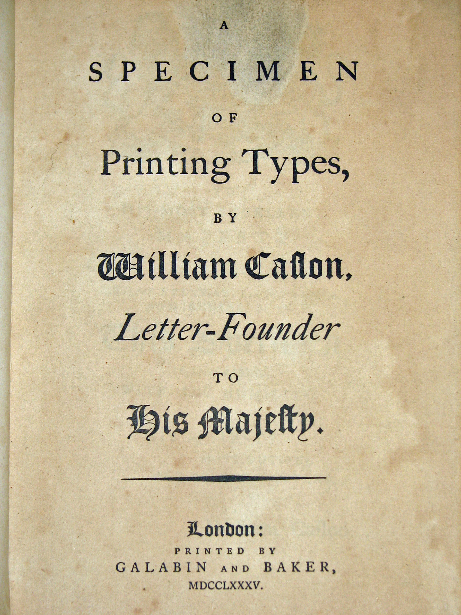
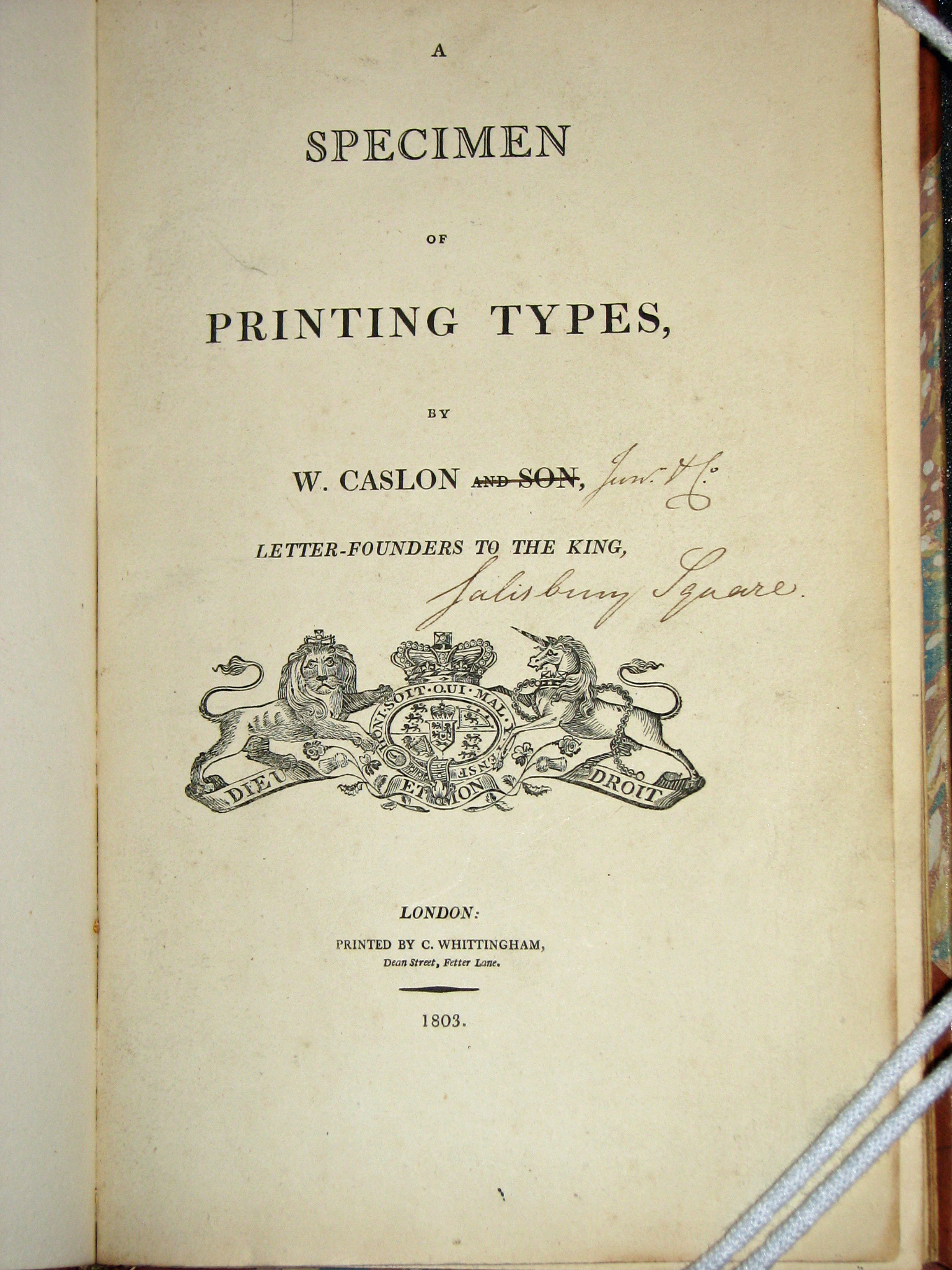
There are two books from the foundry of William Caslon III -- that of 1785 and that of 1803 -- showing the changes in typeface and ornament during the transitional period. The 1785 book [44] was a duplicate from the library of W. Bentinck-Smith, whose own spectacular type specimen collection is housed at Harvard's Houghton Library. The rare 1803 specimen [45] , which has the imprint altered in manuscript to "Wm Caslon Jr & Co.", is bound with the same founder's ornament specimen of 1798. A third William Caslon's specimen is contained in a section of Ephraim Chambers' Cyclopedia to illustrate the article on printing. Bound alongside it are large folding plates that are specimens from Joseph Fry and Alexander Wilson, both of which show the influence of Baskerville and the peak of the transitional style in English type design.
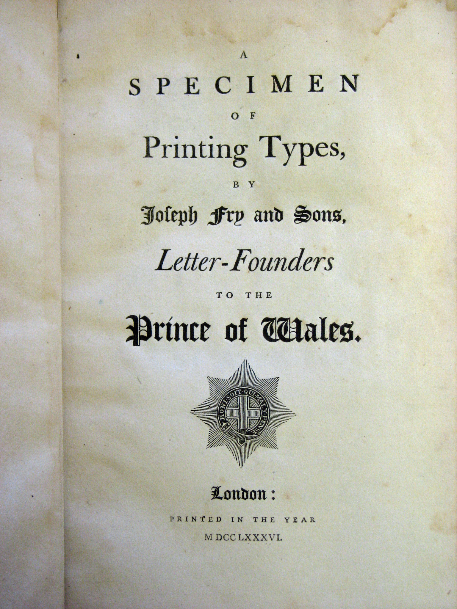
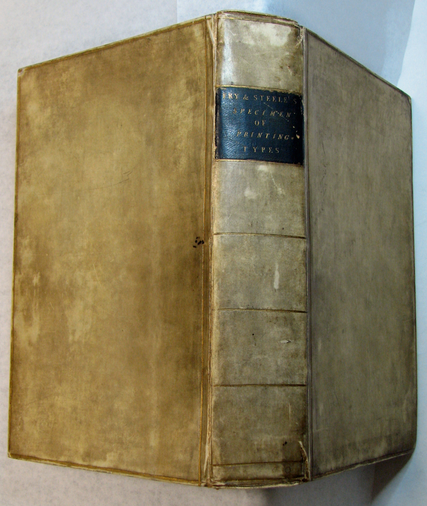
The collection is particularly rich in specimens of the English Fry foundry. Joseph Fry was a Quaker and chocolate manufacturer (the first of many well-known Quaker chocolatiers, including Cadbury and Rowntree), his son Edmund trained as a doctor but owing to deafness could not practice successfully, so turned to typefounding, specializing in Hebrew and other non-Roman types. Updike found the Frys somewhat "Quixotic" for, after attempting to market an improved version of the Baskerville model with little success, they reverted to cloning the Caslon style and even flattered themselves, in their specimen book, that the sorts could be mixed indistinguishably with the originals. The Caslons were not amused and said as much in the preface to their next specimen. On the shelves at the San Francisco Public can be found Joseph Fry's 1786 book [46] with fifty-four leaves, issued four years after his acquisition of an impressive collection of exotic types at the sale of the James Foundry; his son Edmund's 1788 book from his new location in Type Street; as well as the most complete known copy of the Fry and Steele book [47 & 48] of 1794. This book shows "a marked advance on its predecessors," according to Talbot Baines Reed, and also includes a large array of metal cast ornaments. Fry was not a great success as a typefounder, despite his undeniable artistic talents with which he could mimic types of other founders with unerring accuracy. He expended a lot of effort in the cutting of sorts for his collection of "learned" types, many of which lay unused in his foundry.
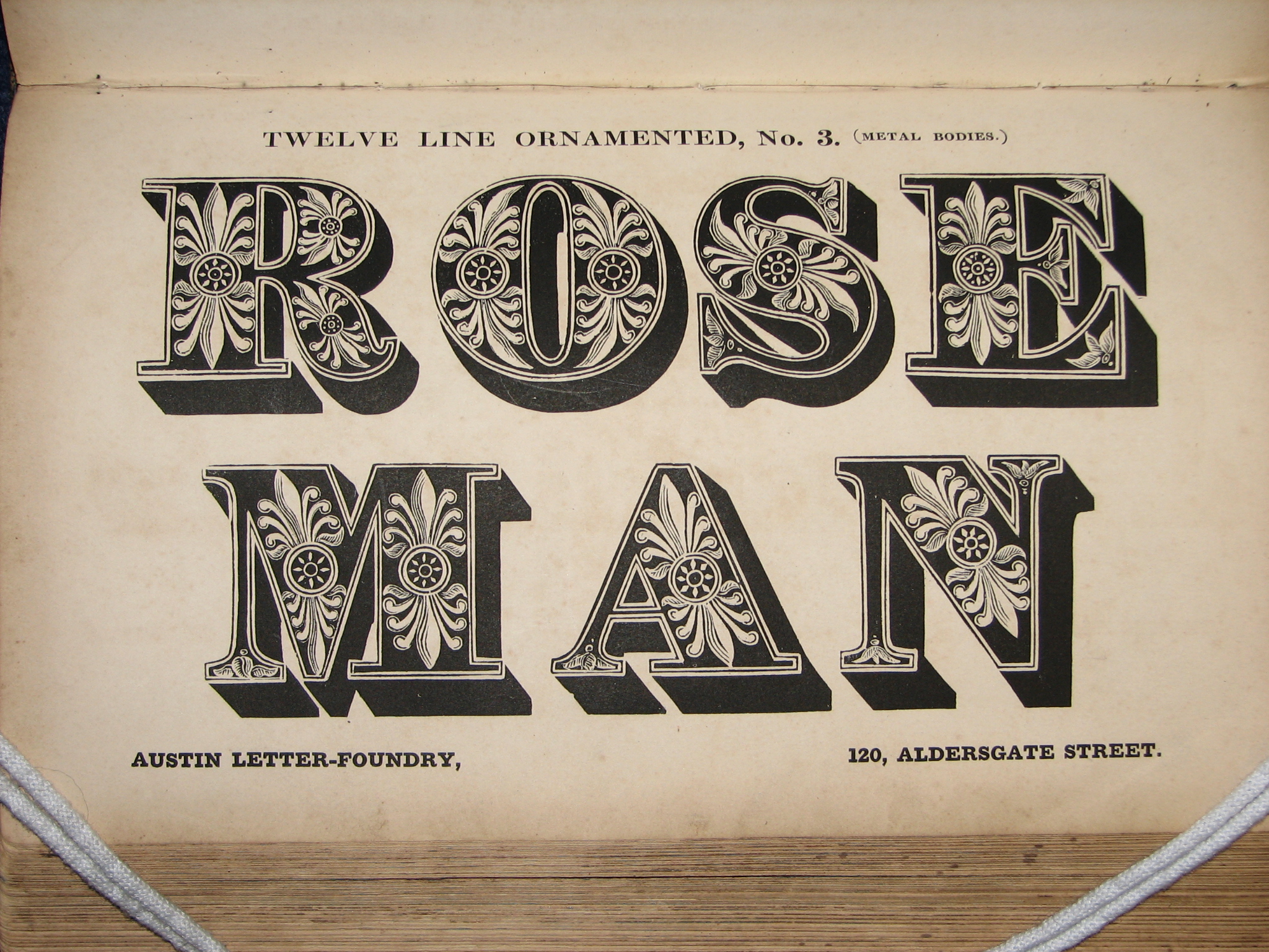
After the philological exertions manifest in his great work Pantographia [49] , 1799, he cut 400 characters of an English Syriac for Bagster's Polyglot Bible, even changing the name of his foundry to the Polyglot Foundry for the last specimen book, issued in 1824, and present in the Grabhorn collection. Although they excelled in the cutting of Georgian types as seen in the Specimen of Modern Cut Printing Types of 1816, the Frys did not much go in for the new display types coming into vogue. Their books possess all the calm and reserve of the great Regency novels of Jane Austen. Near them stands a pinnacle of early decorated types: the Wood and Sharwoods book [50 & 51] of 1834, in which the full filigree of riotous ornament cavorts over some solid early slab serif letterforms, depicting farm animals and floral excess in cornucopic abundance.
The rare French specimens include that of Delacologne [52] (1773), many works of the Fourniers, father and son, (including a 1781 broadside on silk showing "new script types in the English style"), several works of Gillé, the specimen of Gauthier Frère and Cie [53] (Besançon, 1835), and that of Thorey & Virey [54] (Paris, 1843). Luce's rare specimen book [55] contains what was claimed to be the smallest type ever cut until then, a Perle, which is about 4 of our modern typographic points. Luce completed the work begun by Grandjean at the Imprimerie Royale in Paris. It was there he completed the range of types down to this tiny size, more a display of virtuosity than a practical face. Not to be outdone, Bodoni cut a tiny type called "Parmigianina," as his foundry was in Parma, but indeed it is as small as grated cheese! In 1771 Luce issued another specimen indicating the difference between his own types and those of the Imprimerie Royale, which were protected by Royal mandate. He also accused Fournier of plagiarizing his ornaments and innovative condensed face.
"Fournier was the better designer," says A. F. Johnson in Type Designs, "but the idea of his 'poetique', a condensed letter intended for the printing of the long verses of the French Alexandrine without breaking into a second line, was derived from Luce." The Didot work of 1819 promoted his point system, which became an industry standard in Europe. Pierre Didot says in the introduction: "It is true that in the industrial arts there is a point where it is necessary to stop. I do not, however, think I have reached it." The intrinsic interest, elegance, and scope -- not to mention incredible rarity -- of many of these books have a particular resonance for printers and typographers, many of whom would rather spend an hour with them than with the Kelmscott Chaucer [56] in the collection.
Discussing the Vatican Press specimen -- which was published mainly as a work of prestige -- Hendrik Vervliet wrote, "Specimens are the best material for the historical study of printing types, whether for their own sake or contributing to more general history or philology." The lasting value of type specimen books is in their manifestation of industrial art, the way one of the most invisible aspects of society -- the forms of our letters -- changes noticeably over time, subject to technological innovations rather than whims or fads; changes in optics, changes in press technology, inks, papers, and the external influences of other written forms -- manuscript, engraving, sign-writing and other commercial lettering -- are reflected in them. Typography is the invisible glue that holds a culture together, and most people are unaware of its existence or practice. Yet typographers and designers, as well as historians, need to examine these books, and scholars of type know that in the case of the early type specimen books, each one is likely to be unique, and all have to be studied because leaves were frequently added and dropped as the edition was slowly bound up.
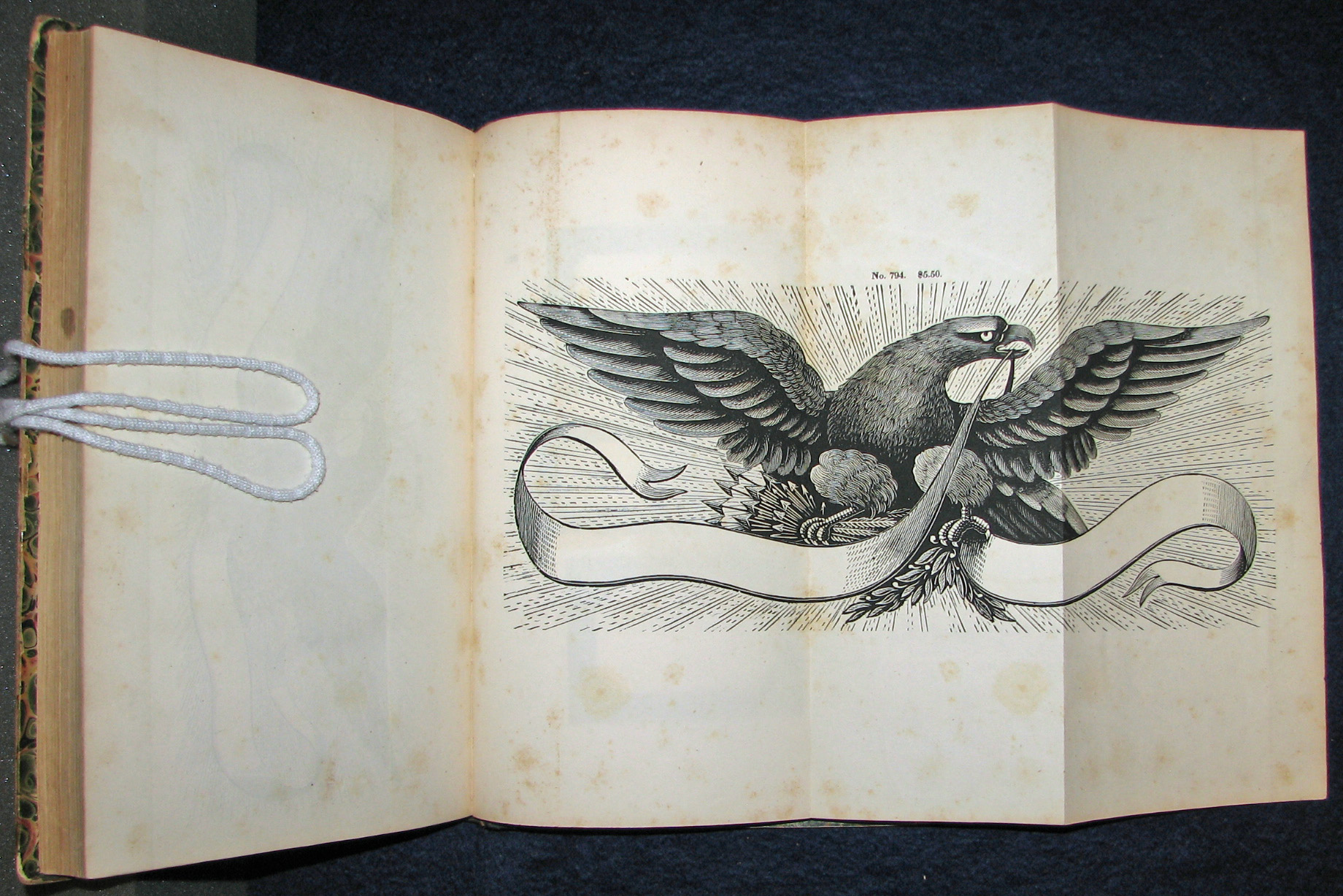
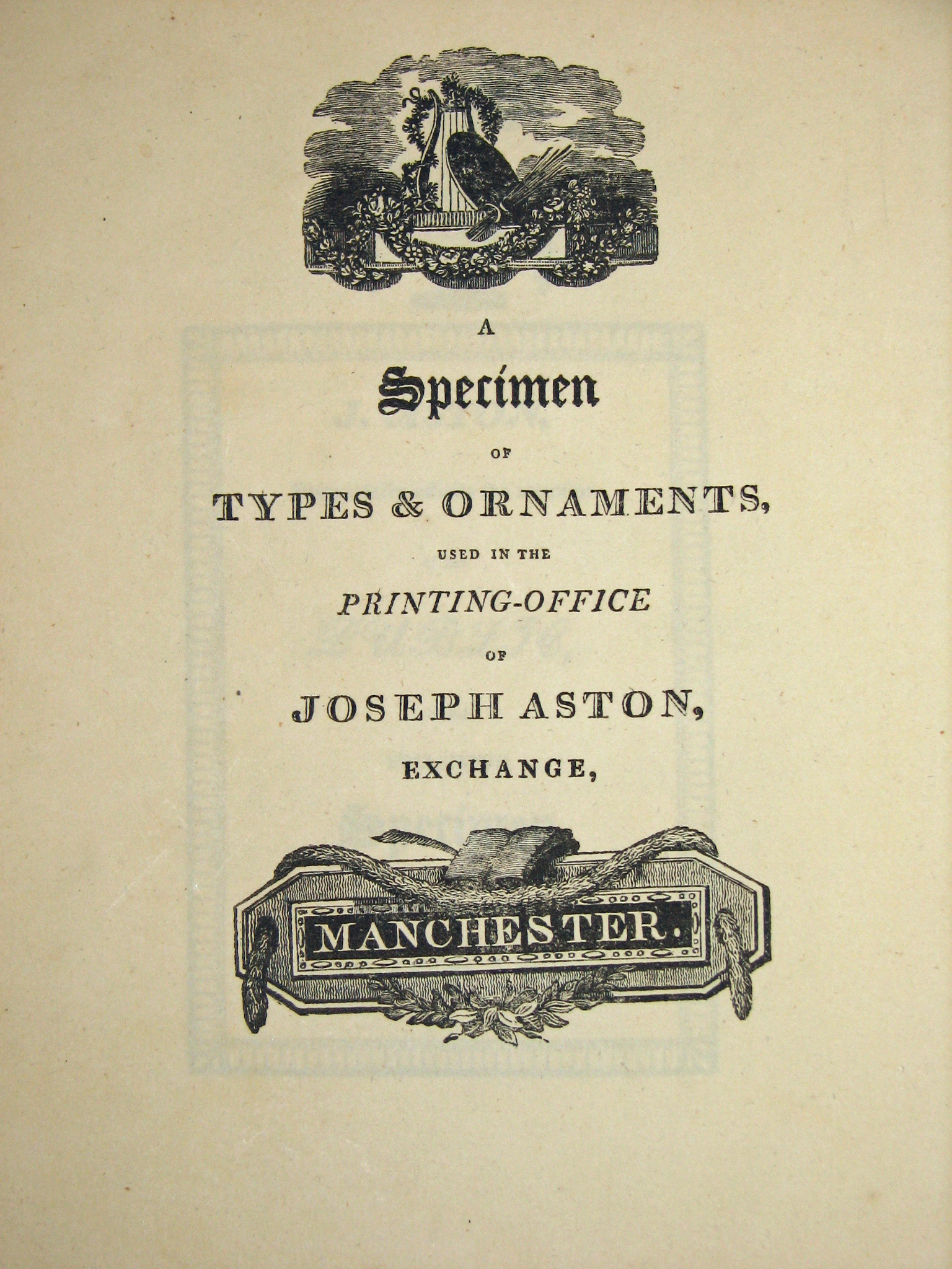
San Francisco is fortunate in having the California Historical Society's Kemble Collection near at hand, another trove of printer's manuals and specimen books. But the type specimen and printer's manual collection of Robert Grabhorn is among the richest and most accessible in the country. To the rare Dickinson specimen of 1856, we can add a pair of early Boston specimens: those of the New England Type Foundry [57 & 58] of 1834 and the Boston Type and Stereotype Co. [59] of 1837, as well as a specimen of John F. Trow, Printer, Stereotyper (New York, 1856). Another extremely rare printer's specimen is that of Joseph Aston [60] of Manchester, 1808.
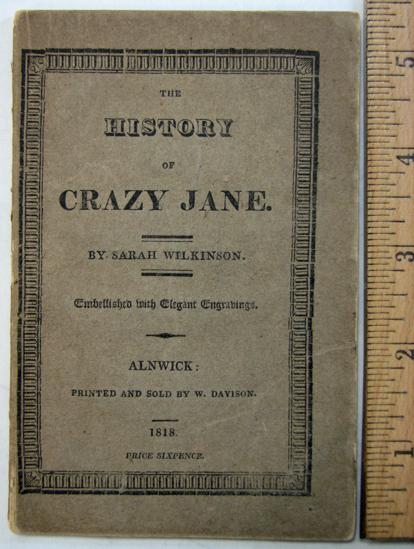
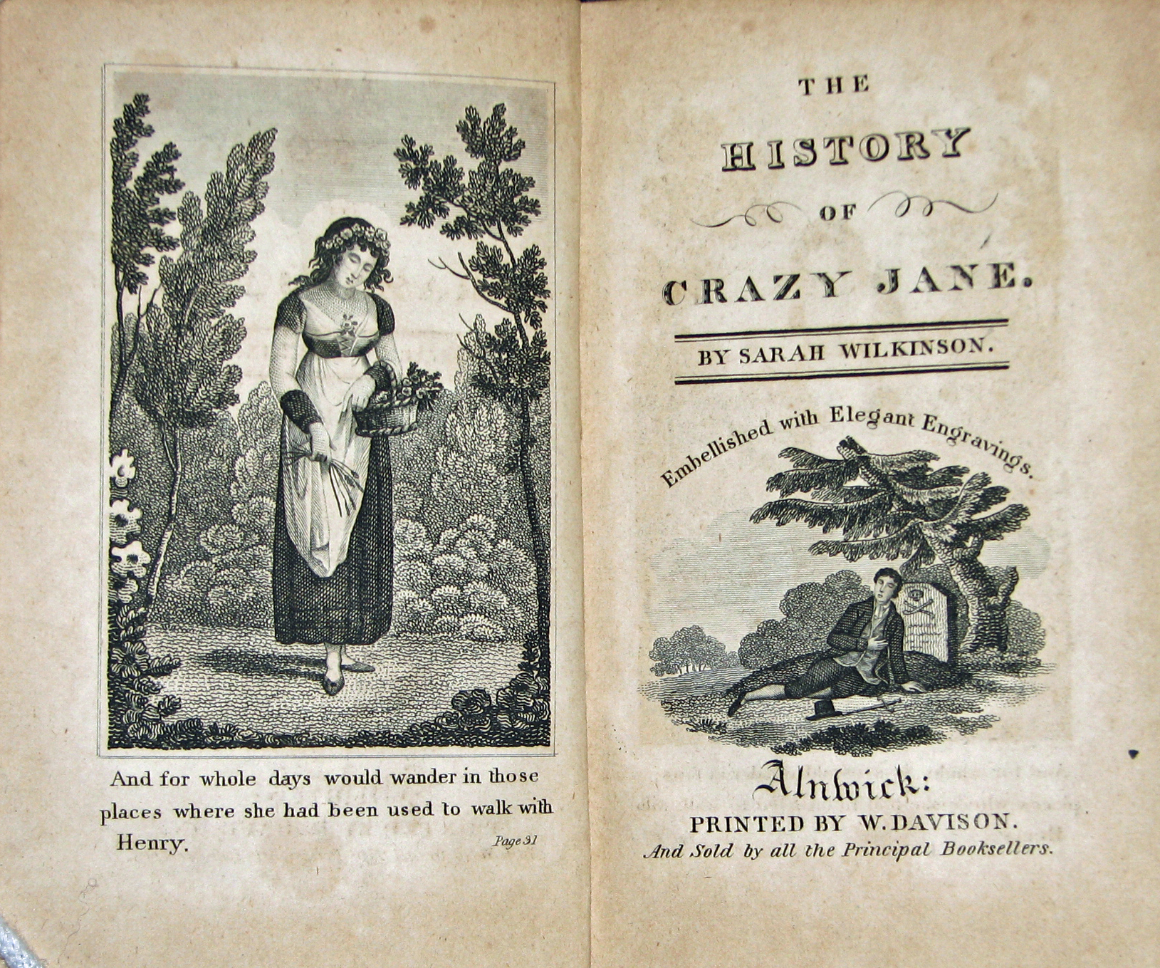
Like Grabhorn, Aston was a provincial printer of taste with a few good patrons. He laid in a stock of the finest types available at this key time in the development of printing types and produced a beautiful small pamphlet, of which I know only one other copy. Grabhorn also owned the 1840 specimen book of William Davison of Alnwick, a provincial printer better known than Aston because of his association with Thomas Bewick. A charming companion piece is an early chapbook of Davison's: Sarah Wilkinson's The History of Crazy Jane [61 & 62] (Alnwick, 1818), with engravings by Luke Clennell, Bewick's pupil. One can imagine the fun in the Grabhorn household when Robert teased his wife, Jane, with the ballad. Sadly, Clennell had a mental breakdown and went into a decline before his early death.
Grabhorn acquired a full complement of printer's manuals and again listed the principal ones in note form: "Ernesti and Gessner, Germany; Fertel, Vincard, Brun, Frey, and Crapelet, France; Smith, Stower, Johnson, Hansard, Savage, and Timperley, England; MacKellar, Adams, and DeVinne, America." Gessner's work (from which Updike drew illustrations) contained important specimens of the "real Dutch types" of the Erhardt foundry and the work of Breitkopf, also of Leipsic, who was praised by Fournier as a major German typefounder and generous friend. Ernesti's 1733 book contained the types of Andrea Endters, which Updike classified, with characteristic finality, as "forty-seven varieties of every degree of tastelessness and, in the smaller sizes, every variety of illegibility."
Fertel's book [63 & 64] is the first important printer's manual published in French. Of the Marcelin Brun work [65], printed by Didot in 1825, Bigmore and Wyman wrote that it is "quite a gem from a typographic point of view," having virtually no hyphens! When Crapelet's preface to his work was published, the English bibliomaniac Reverend Thomas Frognall Dibdin decried it as "his first, hoped to be his last, contribution of literature." But, like the book-crazed cleric, Crapelet went on to write many other works.
The Grabhorn collection includes James Watson's 1713 work, [66 & 67] printed in Edinburgh in avowedly Dutch types (though as John Lane points out, "What Updike shows as by implication [seventeenth-century] 'Dutch types used in England', are in reality eighteenth-century English types used in Scotland!")
The scarce anonymous 1770 edition of Philip Luckombe's Concise History of the Origin and Progress of Printing [68 & 69] (with the 1771 title page laid in, retitling the work The History and Art of Printing), is foremost among a royal flush of English printer's manuals that Grabhorn acquired. John Smith was the author from whose 1755 Printer's Grammar most later writers took their texts. His generic English name may be the pseudonym of a Prussian immigrant: he makes scathing remarks about German typographic practice throughout his work. Luckombe, Stower, and Timperley all used him, as pointed out by Timperley in the preface to his Printer's Manual. Stower's hasty abridgment included the Fry specimen of 1787 that copied Caslon's style. Johnson and Hansard wrote very different books, at the same time, called Typographia, but both borrowed from Smith via Stower. Johnson's work was more original, but he was censured by the critics of the time for his decorative printing. Savage, in 1841, returned to Moxon, but as Moxon's editors point out, "thenceforward any use made of Moxon in technical books on printing was consciously antiquarian." Savage also printed the most useful Practical Hints on Decorative Printing, [70 & 71] 1822.
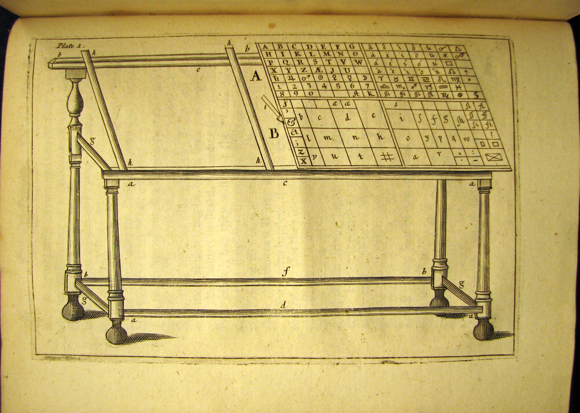
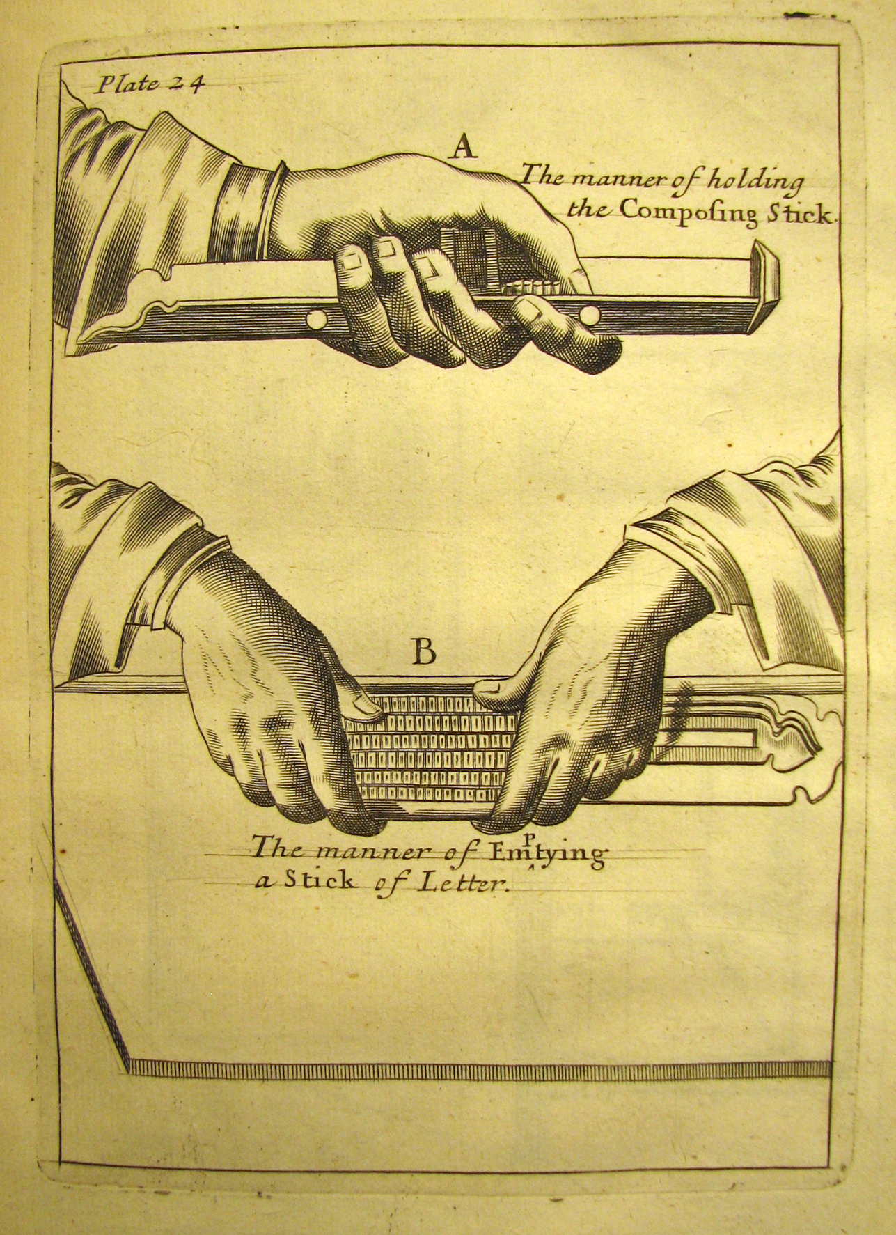
Grabhorn comments: "These men had a way of borrowing from each other and themselves in their various editions. The father of most of them was Joseph Moxon in his Mechanick Exercises [72, 73 & 74] of 1683. Here, this collection has had to make do with DeVinne's annotated reprint edition of 1896." However, although there are less than seventy known surviving copies of Moxon, the Jackson Burke copy was purchased from Dawson's of Los Angeles in 1975. Its arrival at the library was celebrated with a special event. The money to purchase the Moxon came from an auction of duplicates, and there was enough left to also purchase one of the typographical masterpieces of the twentieth century: Bruce Rogers's Oxford Lectern Bible [77] , a real "trouser-press" of a book, as Stanley Morison said.
The Grabhorn collection contains several scarcer printer's manuals, including George Trumbull's Pocket Typographia [75] (Albany, New York, 1846, largely compiled from Savage's Dictionary of 1841), and A. N. Sherman's Printer's Manual (New York, 1834).
Through the public library's collection I have been able to trace quotations used in nineteenth-century specimen books to their sources in the earliest English-language histories of printing. I have traced many of the oft-paraphrased chestnuts back through the pages of specimen books to works by Luckombe, Johnson, Hansard, and Smith, and lesser-known writers like Palmer and Lemoine. As Smith noted, "Which observation we have made on purpose to assist those who delight to exercise themselves in that painful study which attends writing De Origine rerum." I have become convinced that their grandiloquence had some truth behind it when, for example, Philip Luckombe wrote, in 1771: "The usefulness of the art of printing is so universally acknowledged, it needs no proof: everyone knows, without the invention of this Art, the productions of great men would have been confined in the possession of a few, and of no utility to posterity."
Fortunately, the library has taken the right road in conservation, and, rather than rebinding broken and damaged books (losing in the process original boards and endpapers), the current policy is to preserve the books in protective enclosures. (The book blocks still articulate perfectly when the boards are detached; they just require more care in handling.)
Grabhorn concluded in his essay, "Holes must be filled, new discoveries are made, and there are continuing contributions to the subject. It is the duty of a library to keep its collections alive and more than that to make its resources known." The collection is a growing, living entity and is in constant use. Being in a public institution, it is open to everyone. The librarians encourage teachers to bring in their classes. The neophyte design students I've brought in never fail to make the connection that the typography in these books is far from dead history and an important standard to study. Type designers drop by to examine rare specimen books, and calligraphers and binders make frequent use of the collection.
The San Francisco Public has fulfilled Grabhorn's charge, despite tightening civic budgets, in accessioning important new works in the book arts, like James Mosley's 1993 study of L. J. Pouchée's Ornamented Types, a newly documented collection of wood type patterns that shows the efflorescence of display type decoration in the Regency.
Though trendy critics regularly signal the imminent demise of the book, it still has validity as an ultimate source, as a repository of knowledge, and a cultural indicator. Our uses for the book may change, but it is not a closed form; it is a wonderfully concise container of ideas that expresses itself and its time not just in the author's words but in the typography and production values. A collection such as the Grabhorn is an inviting slice of history, concentrating on the period when ideas became fixed in written form and mass-communicated in print. But beyond this, the Grabhorn collection documents the small steps that were taken by the book manufacturers in improving the typefaces, the ideas of proportion and balance, and the materials of the book, making it the perfect behind-the-scenes collection for the study of the mechanics of culture. One can only reiterate the importance of a collection such as the Grabhorn to us, by quoting from one of the books in it, John Johnson's Typographia [78] of 1824:
"Of all the discoveries which have been made, we conceive the reflecting mind will admit that none have tended more to the improvement and comfort of society than that of printing."
Thanks to the staff of the Book Arts & Special Collections Center. An earlier version of this article appeared in Bookways, copyright 1995-2013 by Alastair Johnston, Creative Commons License.
PDF copy of The Robert Grabhorn Collection on the History of Printing and Development of the Book at The San Francisco Public Library by Alastair Johnston.
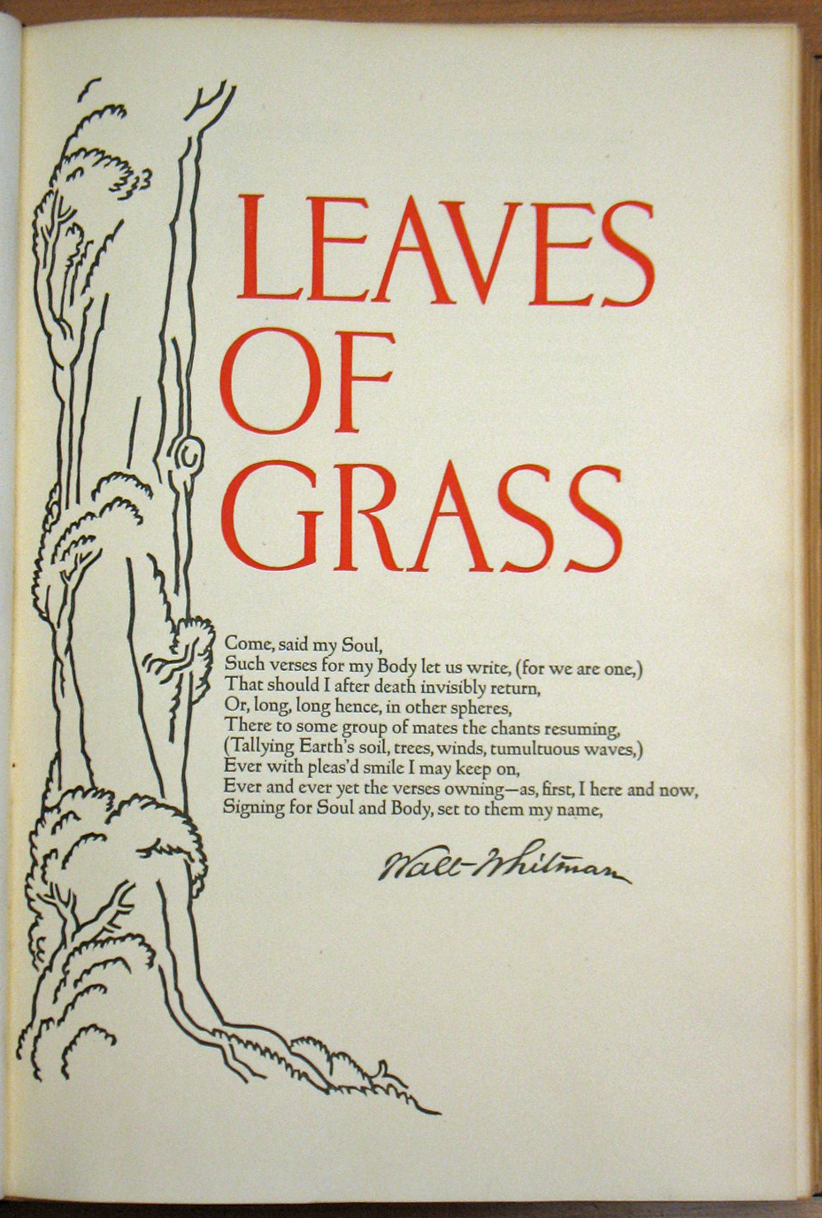 1. Walt Whitman, Leaves of Grass. (Grabhorn Press, 1930)
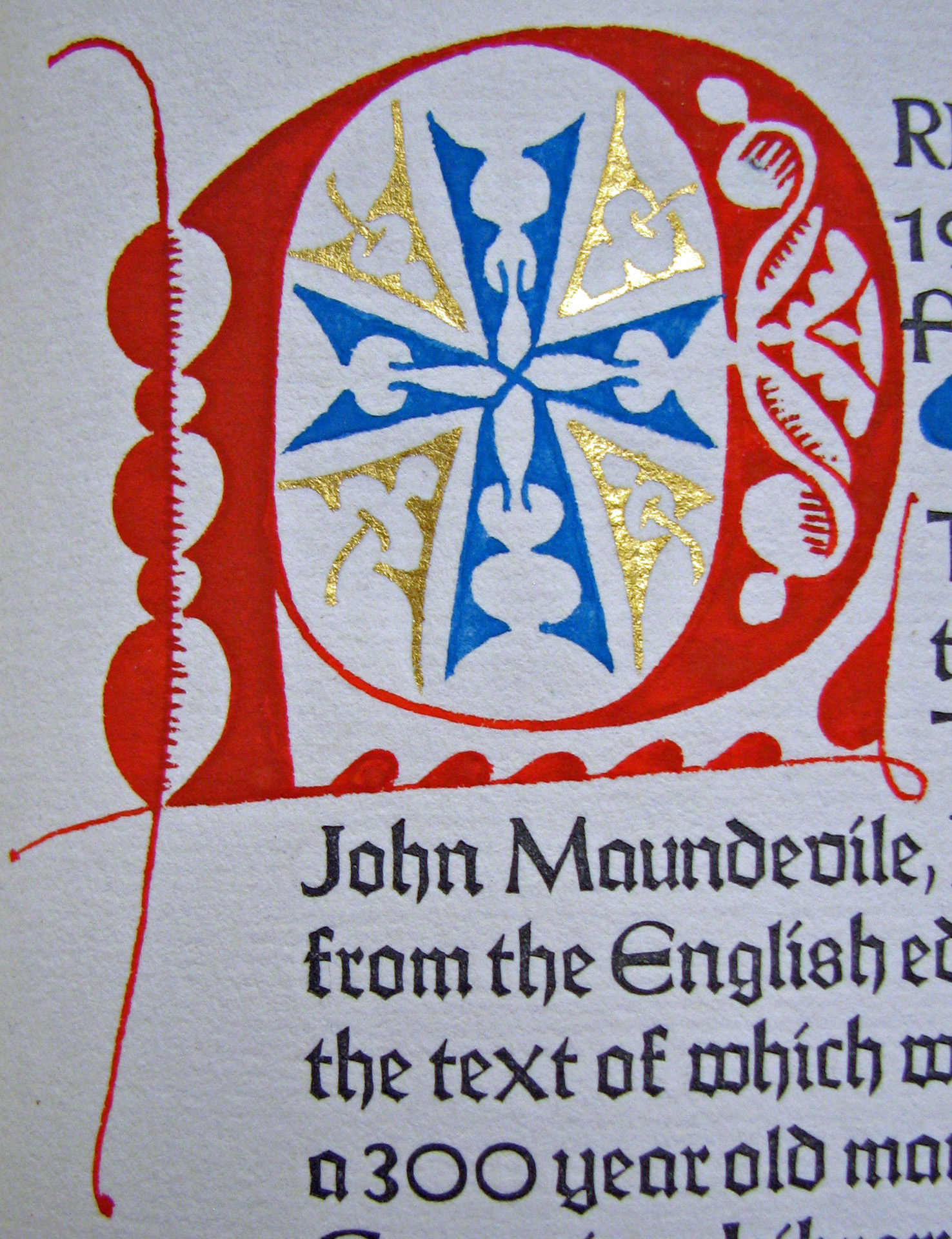 2. Sir John Maundevile, The Voyage of Sir John Maundevile, detail. (Grabhorn Press, 1928)
 3. Dante, Le Terze di Dante. (Aldus Manutius, 1502)
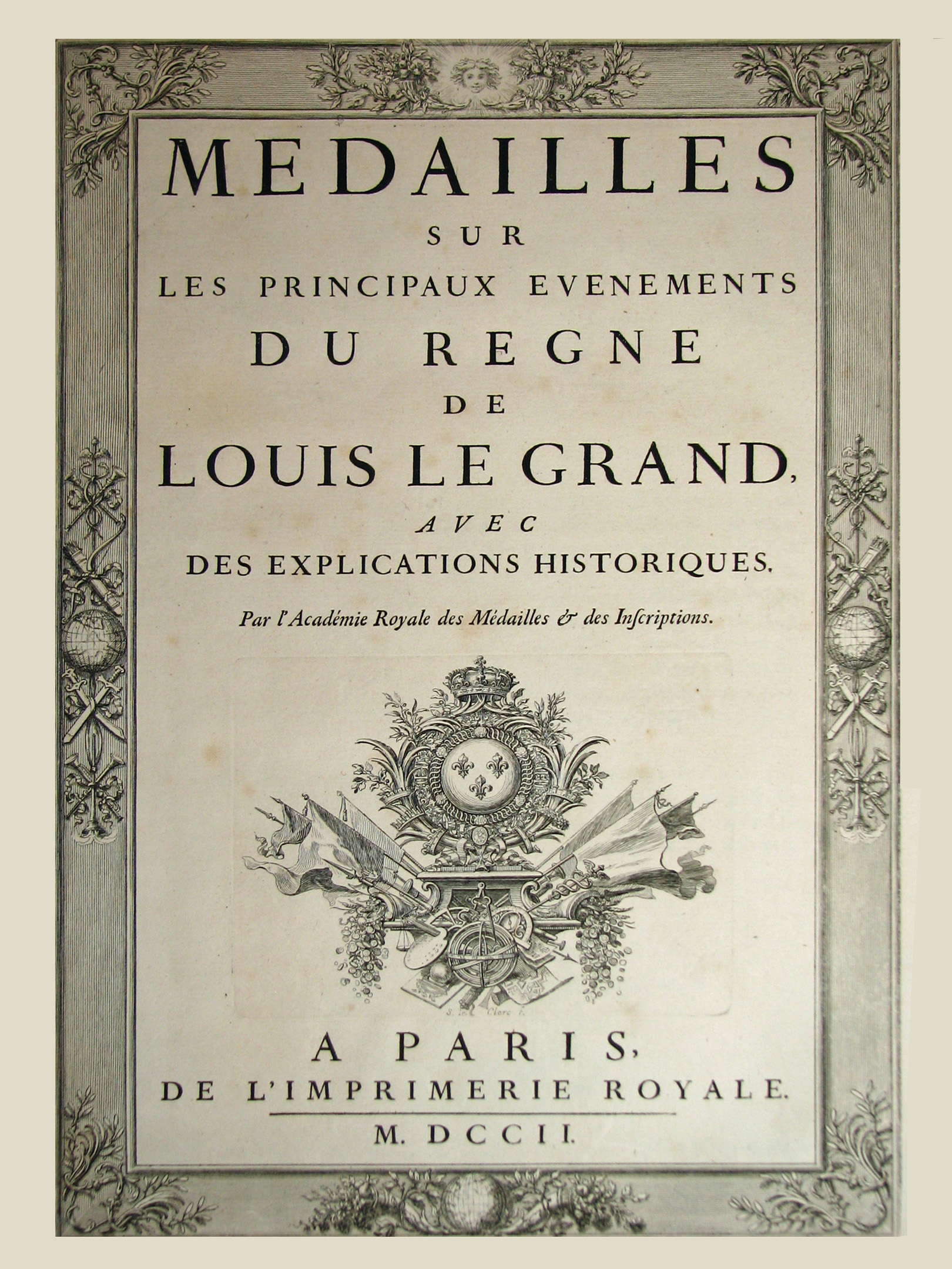 4. L’Academie Royale des Medailles & des Inscriptions. (L’Imprimerie Royale, 1702)
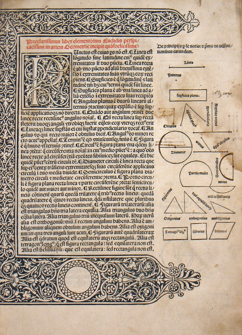 5. Euclid, Preclarissimus liber elementorum Euclidis… (Erhard Ratdolt,1482)
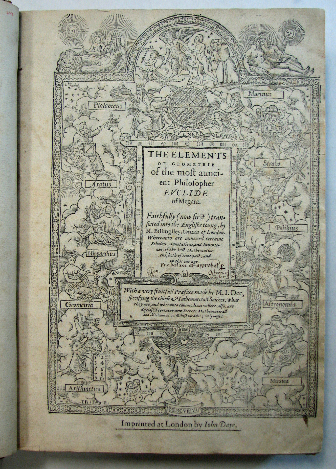 6. Euclid, The Elements of Geometrie. (John Daye, 1570)
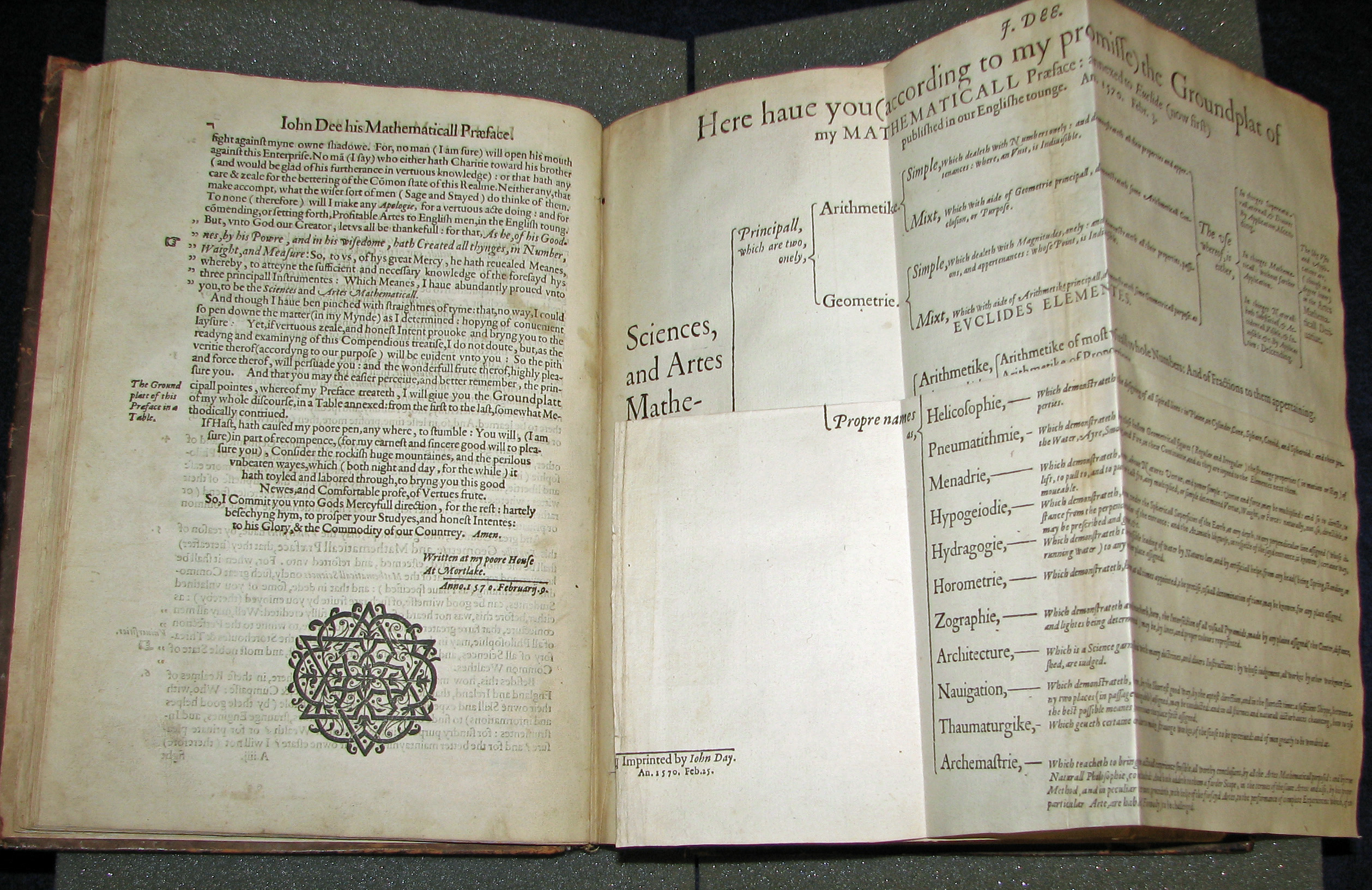 7. Euclid, The Elements of Geometrie. (John Daye, 1570)
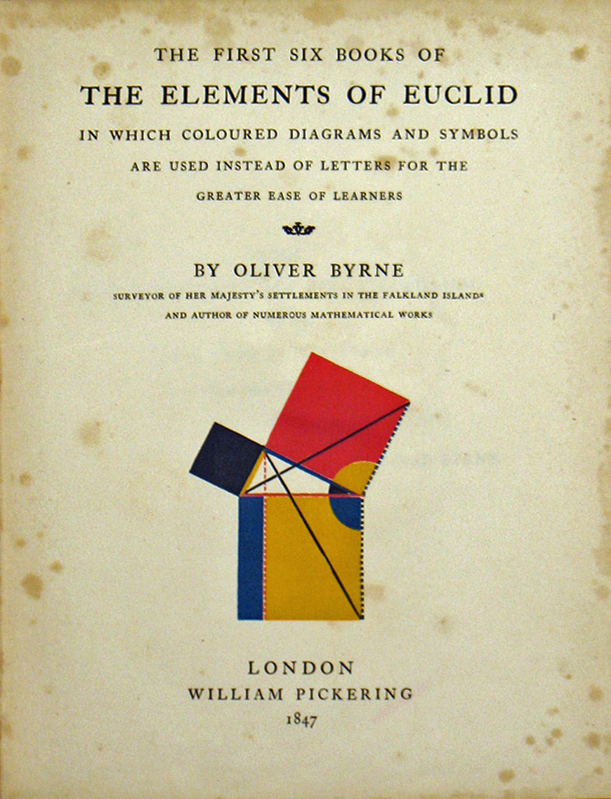 8. Oliver Byrne, The First Six Books of the Elements of Euclid. (Chiswick Press, 1847)
 9. Oliver Byrne, The First Six Books of the Elements of Euclid. (Chiswick Press, 1847)
 10.Giovanni Trissino, Dialogo Intitulato Il Castellance. (Janicolo, 1529)
 11.Giovanni Trissino, Dialogo Intitulato Il Castellance, detail. (Janicolo, 1529)
 12. Albrecht Durer, Hierinn Sind Begriffen… (1528)
 13. Albrecht Durer, Hierinn Sind Begriffen… (1528)
 14. Albrecht Durer, Vnderweysung der Messung…, detail. (1525)
 15. Geoffrey Tory, Champ Fleury, detail. (1529)
 16. Geoffrey Tory, Champ Fleury. (1529)
 17. Geoffrey Tory, Champ Fleury, detail. (1529)
 17a. Raymundus Jordanus, Idiota de Statu Religiosorum. (Simon de Colines, 1521)
 18. Maurus Terentianus, Literis Syllabis Pedibus & Metris. (Simon de Colines, 1531)
 19. Oronce Finé, Orontij Finei delphinatis de mundi… (Simon de Colines,1542)
 20. Libro del Cosmographia. (Pedro Apiano,1548)
 21. Valentin Haüy, Essai sur l'Education des Aveugles. (Clousier,1786)
 22. Mary Potter, Poetry of Nature. (J.P. Cooke, 1789)
 22a. An Historical and Geographical Description of Formosa. (George Psalmanazar, 1679?-1763)
 22b. Le Livre de Quatre Couleurs. (Louis Antoin Caraccioli, 1757)
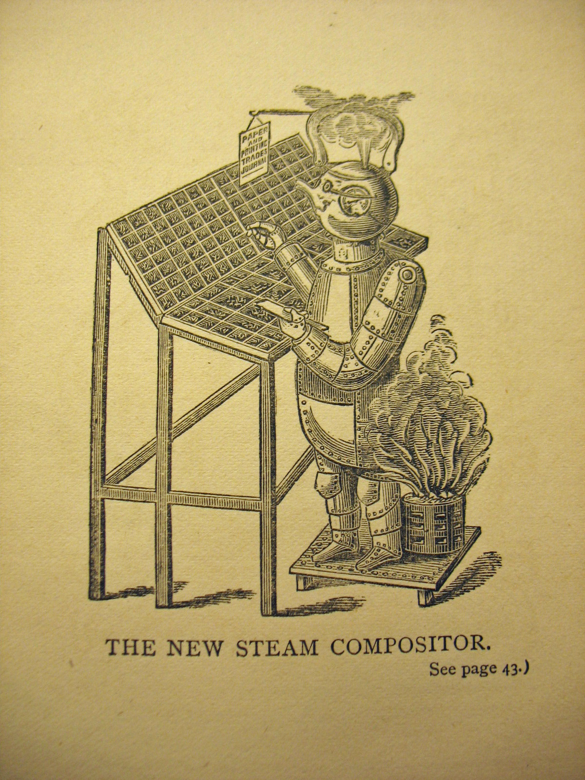 23. Andrew Tuer, Quads Within Quads. (Leadenhall Press, 1884)
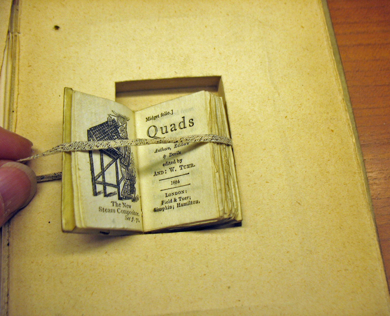 24. Andrew Tuer, Quads Within Quads, detail. (Leadenhall Press, 1884)
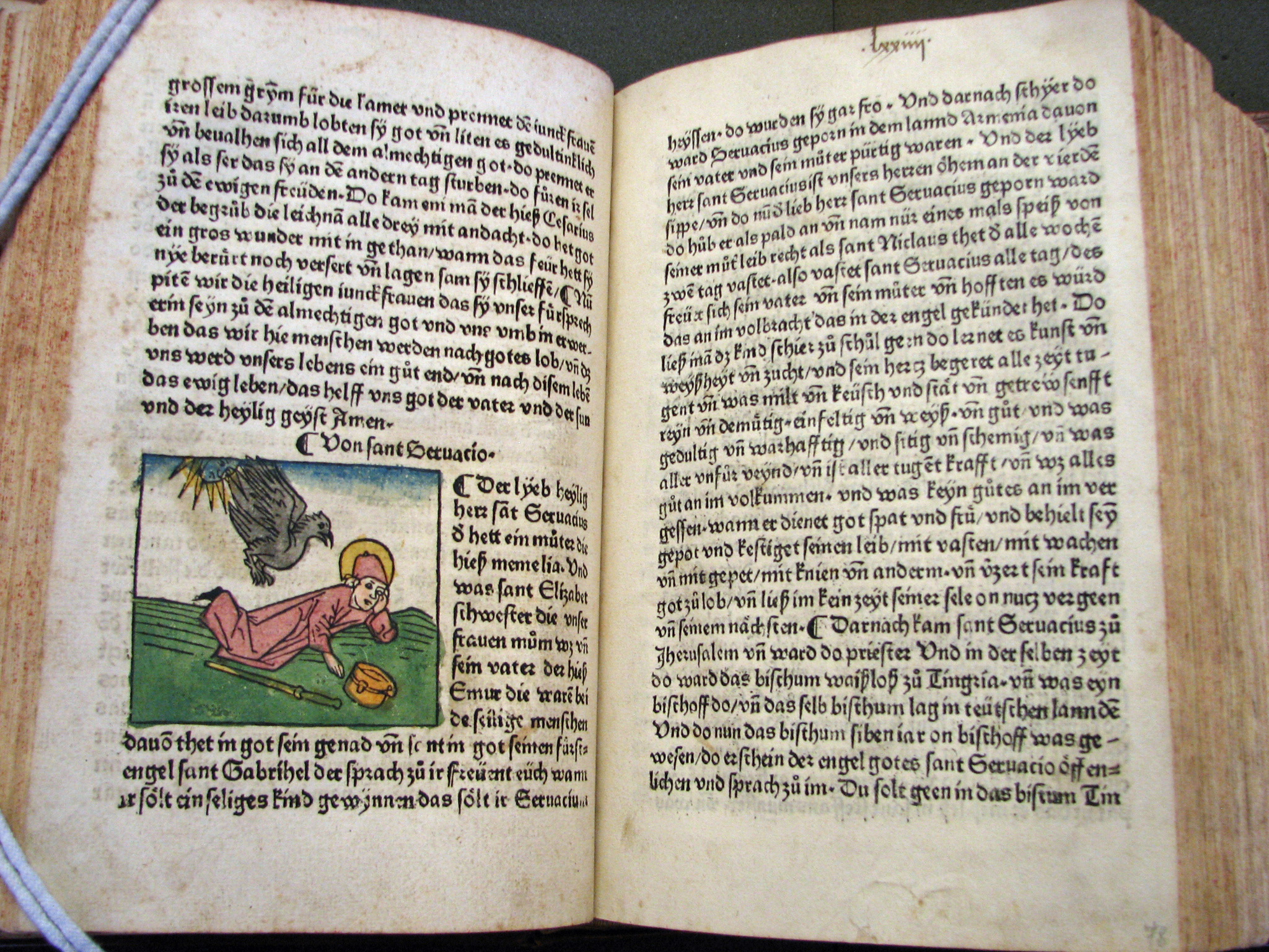
 25. Bible. Latin. New Testament. Manuscript (mid 15th century)
 26. Jacobus de Varagine, Legeda hec aurea …(Johann Bamler, 1475)
 27. Francesco Colonna, La Hypnerotomachia di Poliphilo, detail.(Aldus Manutius, 1499)
 28. Francesco Colonna, La Hypnerotomachia di Poliphilo, detail.(Aldus Manutius, 1499)
 29. Bible. (Robert Estienne, 1546)
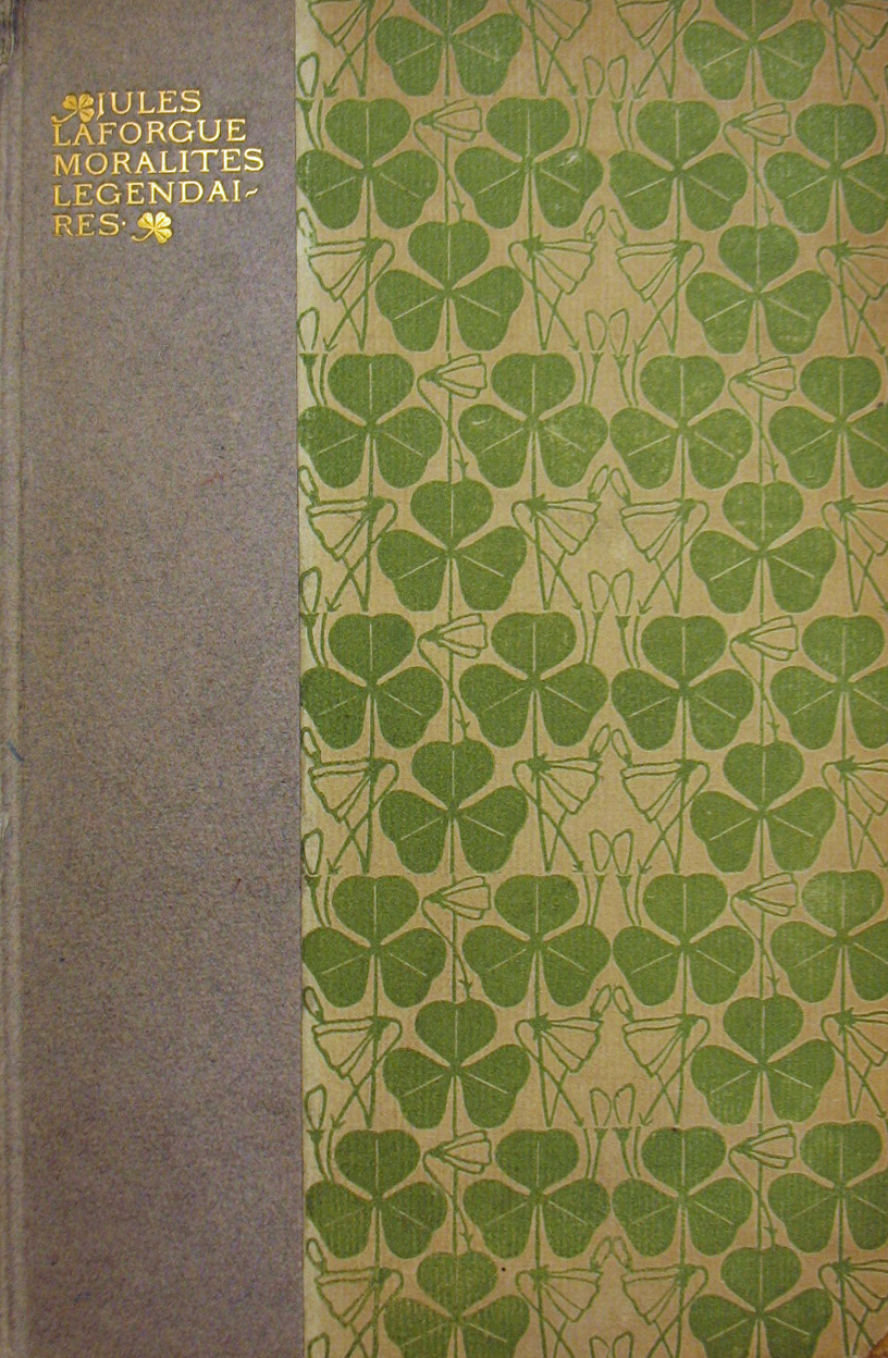 30. Jules LaForgue, Moralites Legendaires. (Eragny Press, 1897)
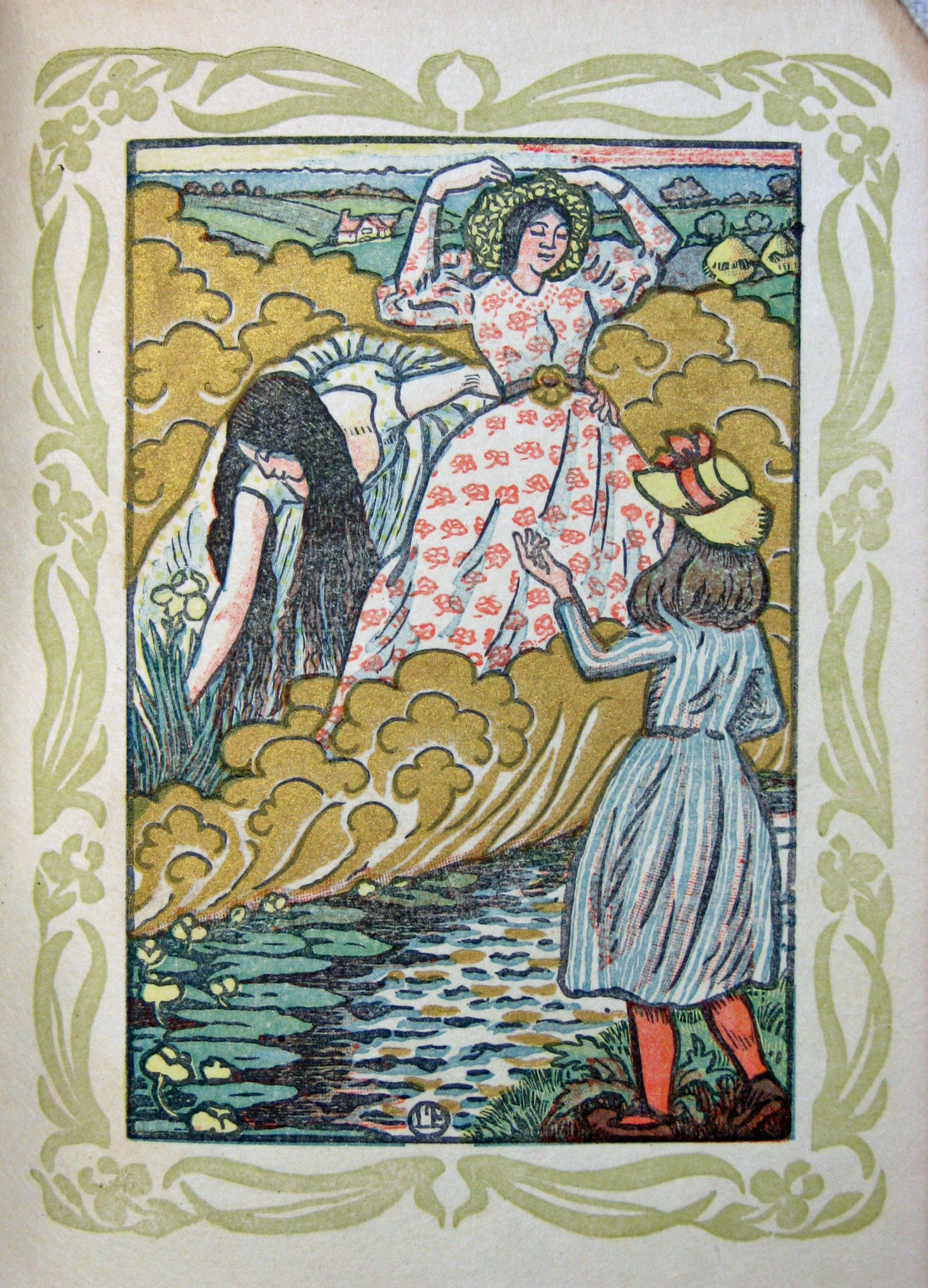 31. Margaret Rust, The Queen of the Fishes. (Eragny Press, 1894)
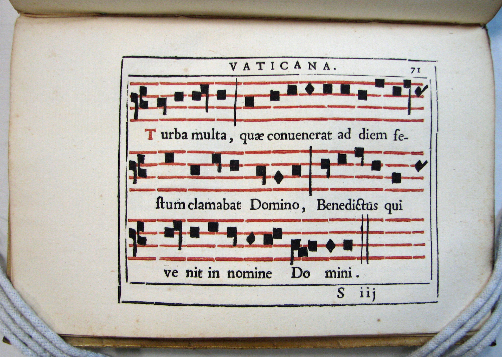 32. Indice de Caratteri. (Stampa Vaticana & Camerale, 1628)
 32a. Indice de Caratteri. (Stampa Vaticana & Camerale, 1628)
 33. Die Wol-Eingerichtete Buchdruckerij, detail. (J H G Ernesti, 1721)
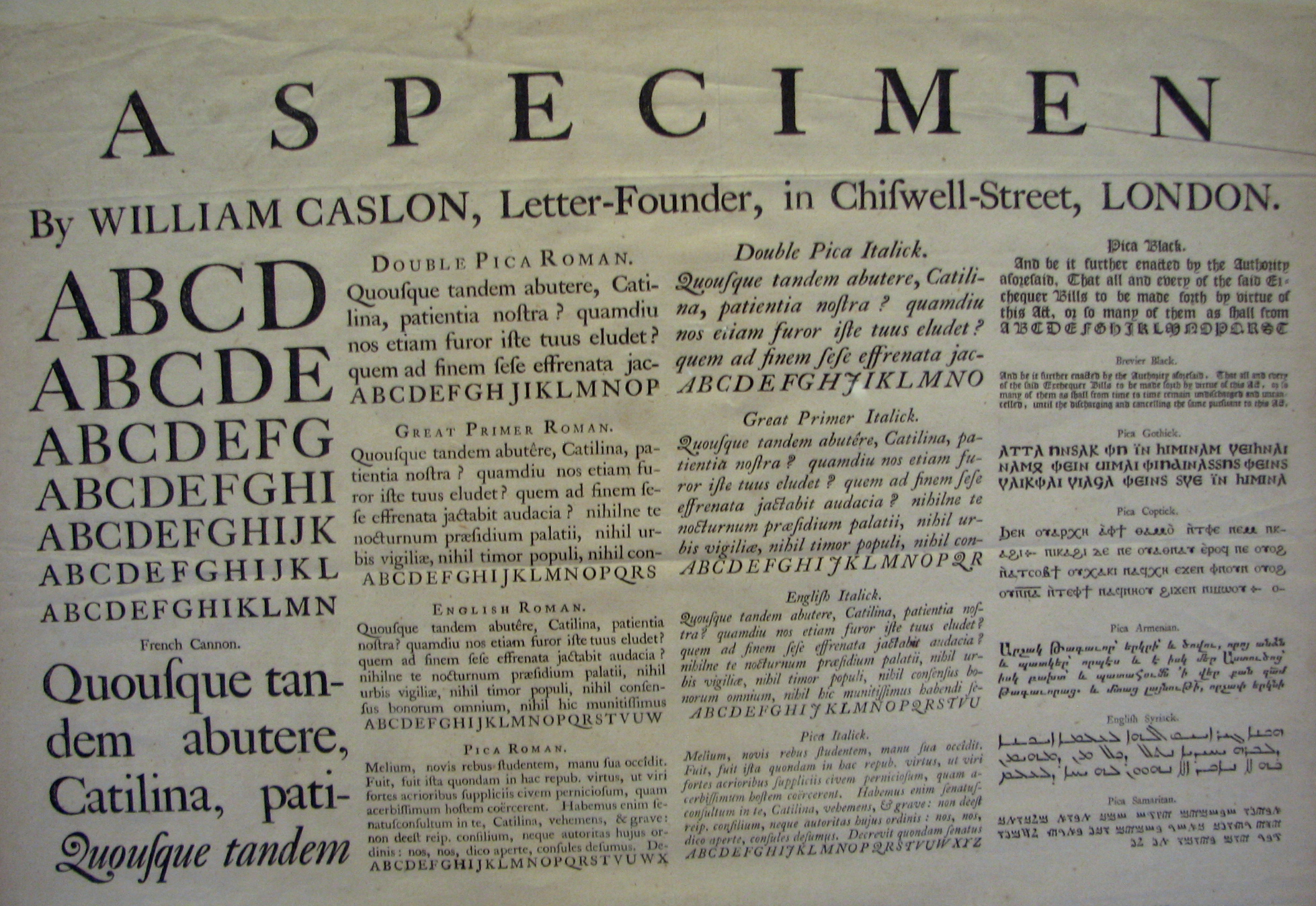 34. Caslon type specimen, detail. (William Caslon, 1734)
 36. Caraeters de l’Imprimerie. (Fournier le jeune, 1764)
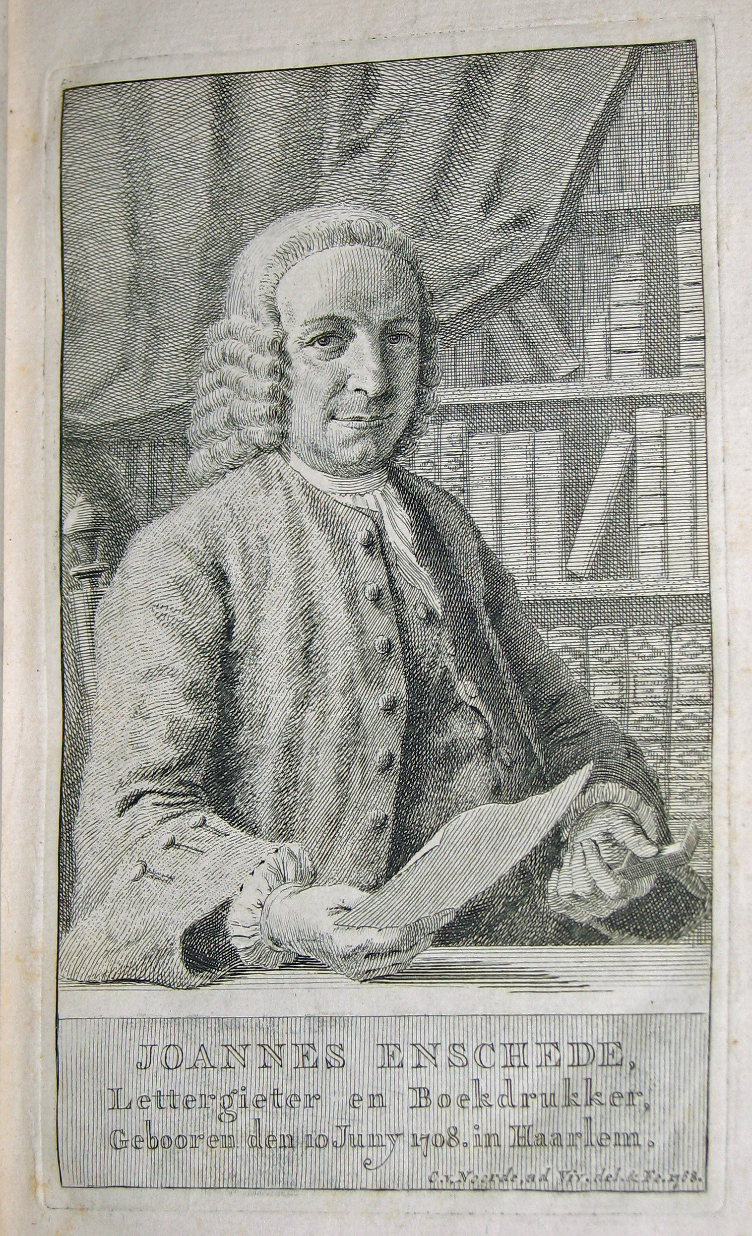 37. Proef van Letteren… (Johannes Enschedé, 1768)
 38.Manuale Typografico. (Giambattista Bodoni, 1818)
 39. Specimen des Nouveau Caractères… (Pierre Didot, 1819)
 40. The General Specimen Book… (Dickinson Type Foundry, 1856)
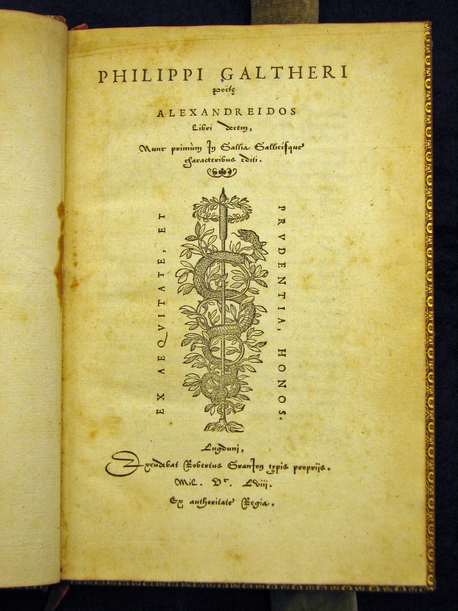 41. Phillipus Galtherus, Alexandreidos. (Robert Granjon, 1588)
 42. Congre. de Alphabetum… (Propaganda Fide, 1789)
 44. A Specimen of Printing Types. (William Caslon, 1785)
 45. A Specimen of Printing Types. (W. Caslon Junior & Co., 1803)
 46. A Specimen of Printing Types. (Joseph Fry, 1786)
 47. A Specimen of Printing Types. (Edmund Fry & Isaac Steele, 1794)
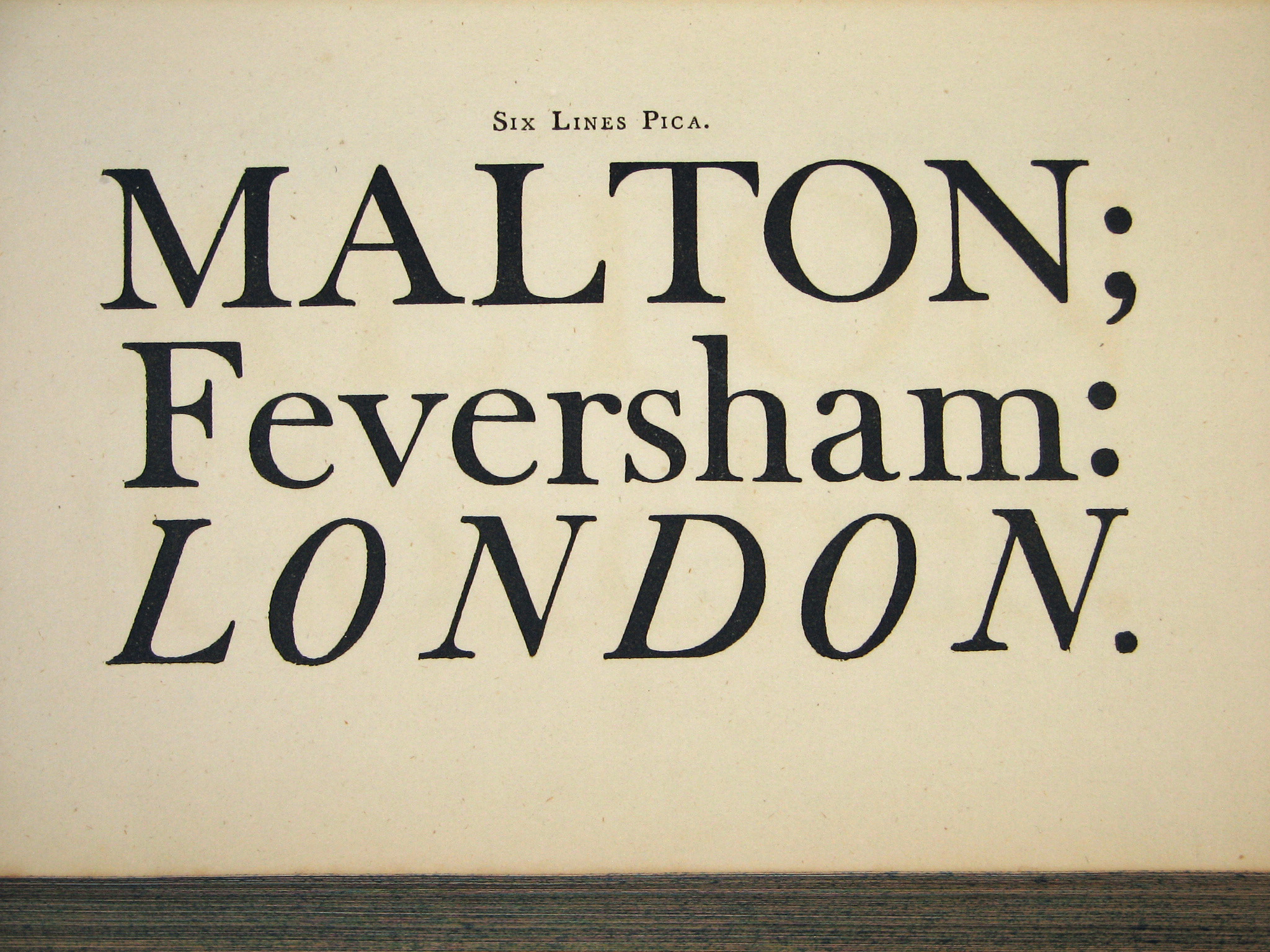 48. A Specimen of Printing Types. (Edmund Fry & Isaac Steele, 1794)
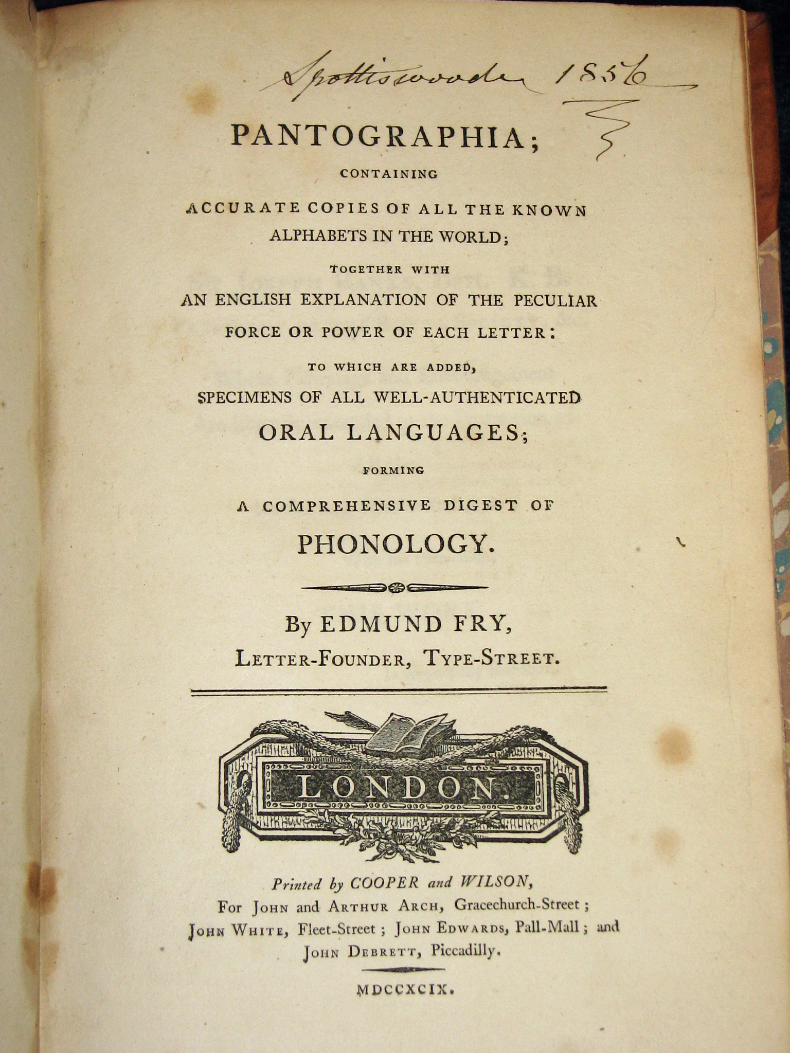 49. Edmund Fry, Pantographia. (Cooper & Wilson, 1799)
 50. The Specimen Book of Types… (Wood & Sharwoods, 1838)
 51. The Specimen Book of Types… (Wood & Sharwoods, 1838)
 52. Les Caracteres et les Vignettes … (Delacolonge, 1773)
 53. Epreuves de quelques Caractères…detail. (Gauthier Frere et Cie, 1835)
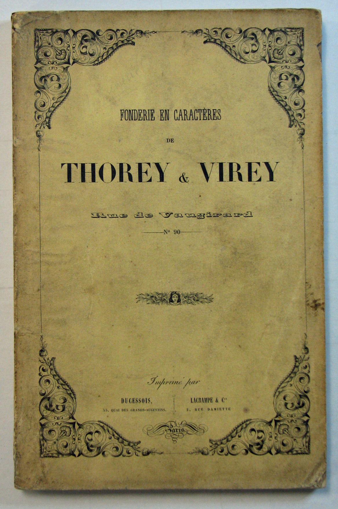 54. Fonderie en Caracteres. (Thorey & Virey, 1843)
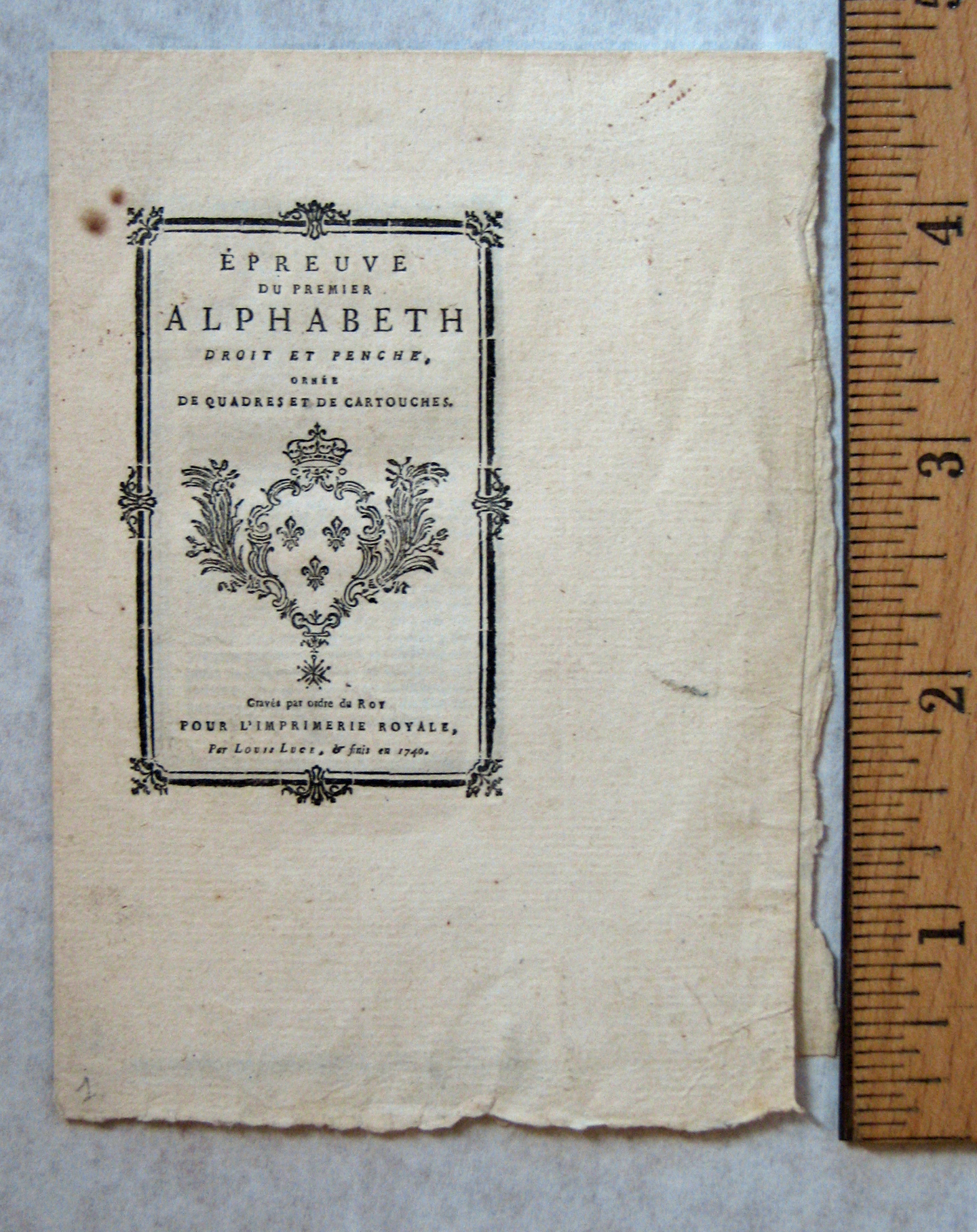 55. Epreuve du Premier Alphabeth… (Louis Luce, 1740)
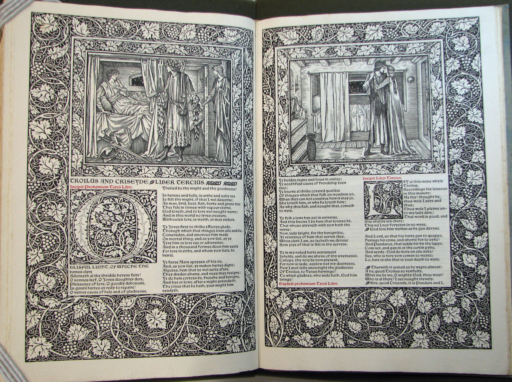 56. Geoffrey Chaucer, The Works of Geoffrey Chaucer. (Kelmscott Press, 1896)
 57. Specimen of Printing Types. (New England Type Foundry Co., 1834)
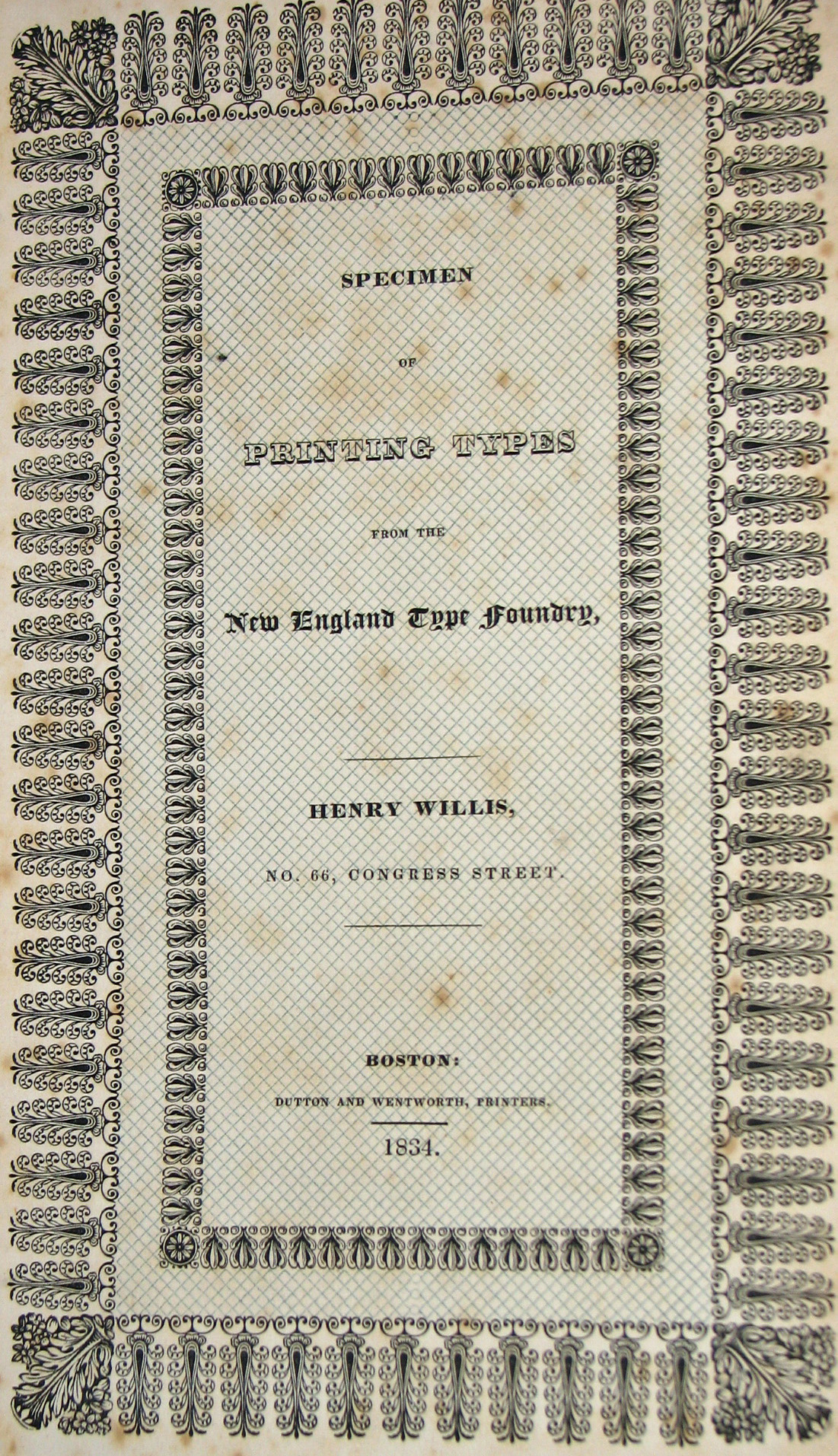 58. Specimen of Printing Types. (New England Type Foundry Co.,1834)
 59. Specimen of Modern Printing Types. (Boston Type and Stereotype Co., 1837)
 60. A Specimen of Types & Ornaments. (Joseph A. Aston, 1808)
 61. Sarah Wilkinson, The History of Crazy Jane. (W. Davison, 1818)
 62. Sarah Wilkinson, The History of Crazy Jane. (W. Davison, 1818)
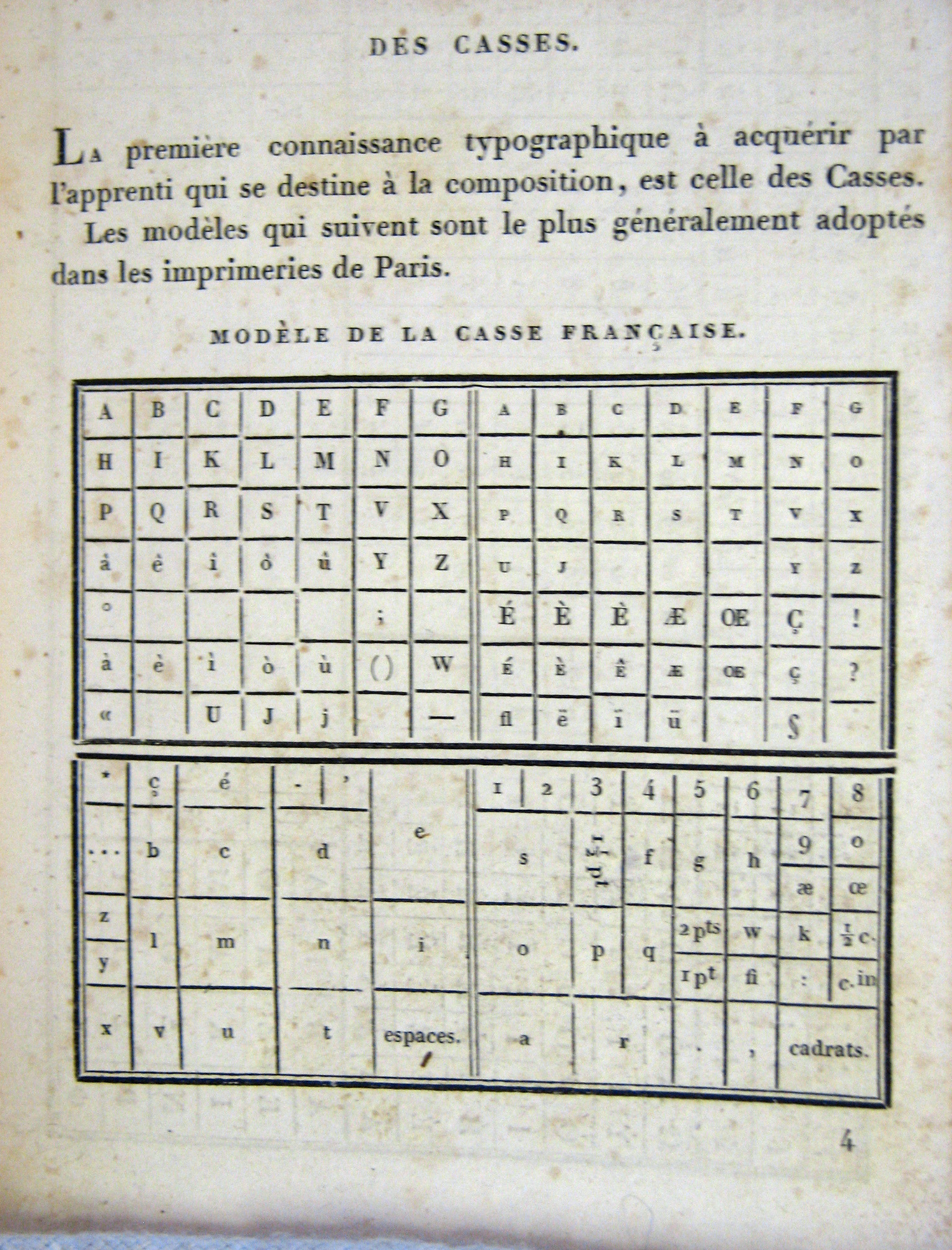
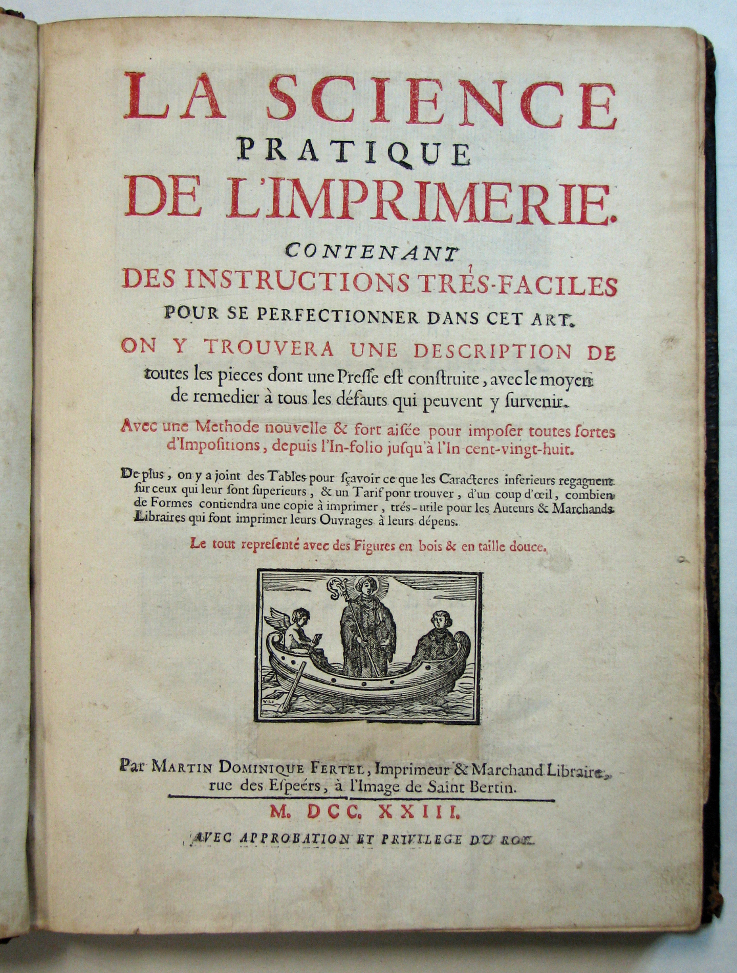 63. La Science Pratique de L’Imprimerie. (Martin Fertel, 1723)
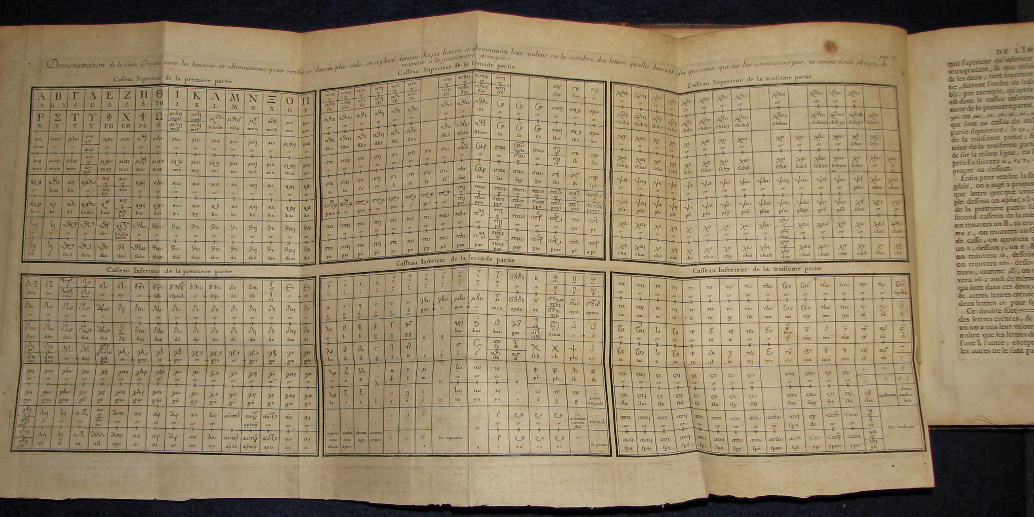 64. La Science Pratique de L’Imprimerie. (Martin Fertel, 1723)
 65. Marcelin Brun, Manuel Pratique et Abrégé. (Pierre Didot, 1825)
 66. The History of the Art of Printing. (James Watson, 1713)
 67. The History of the Art of Printing. (James Watson, 1713)
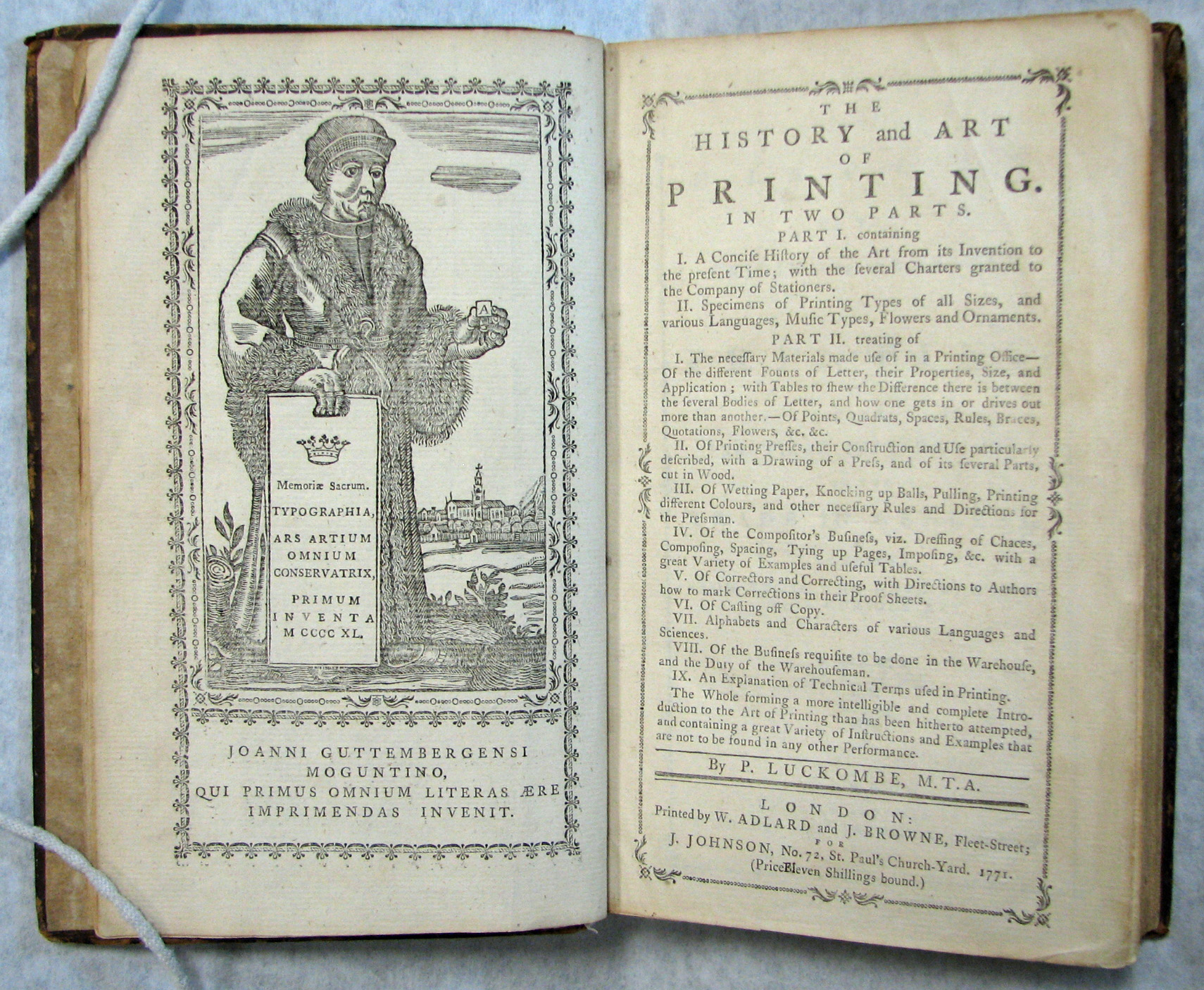 68. The History and Art of Printing. (Philip Luckombe, 1771)
 69. The History and Art of Printing. (Philip Luckombe, 1771)
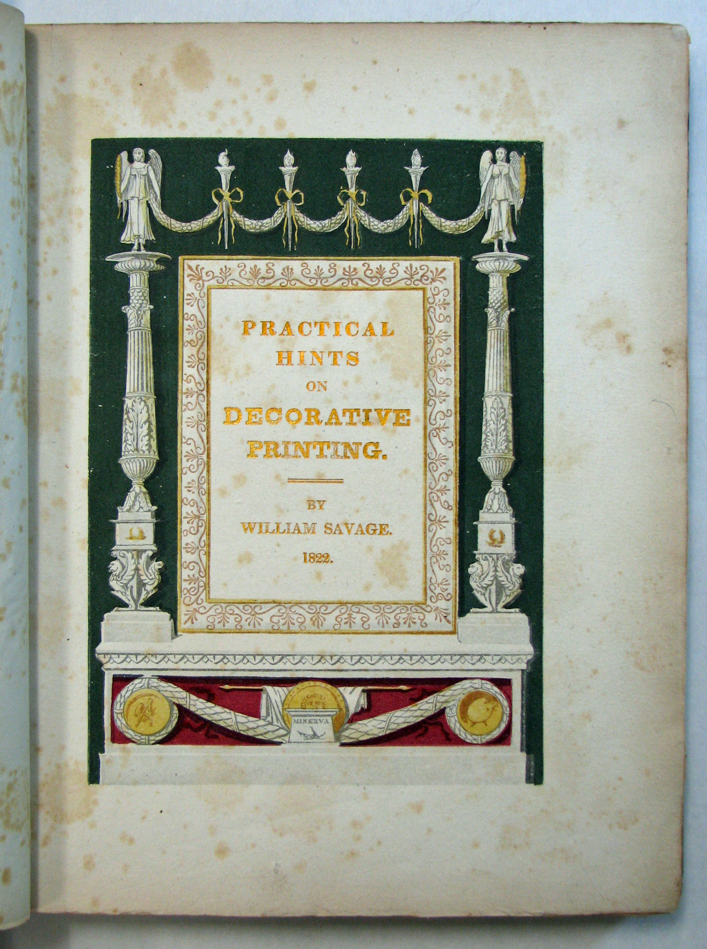 70. Practical Hints on Decorative Printing. (William Savage, 1822)
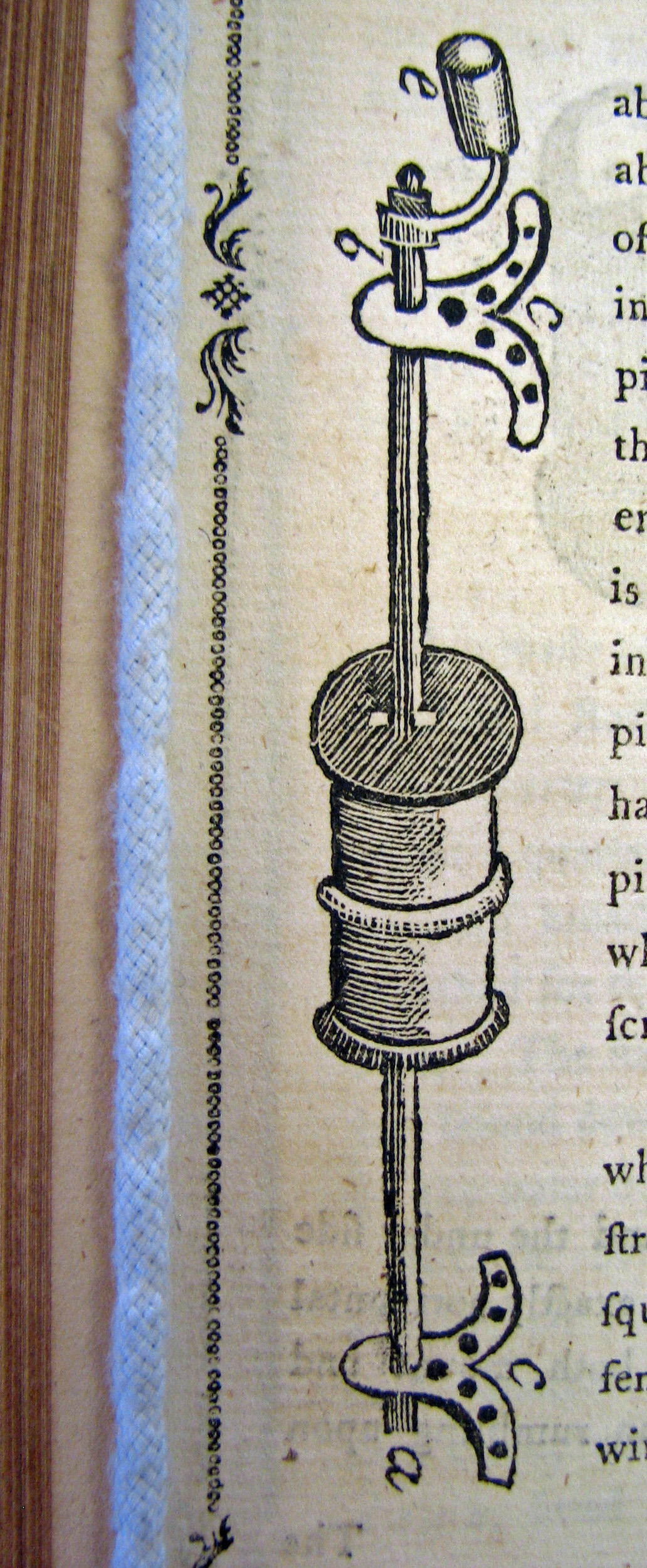
 71 . Practical Hints on Decorative Printing, detail. (William Savage, 1822)
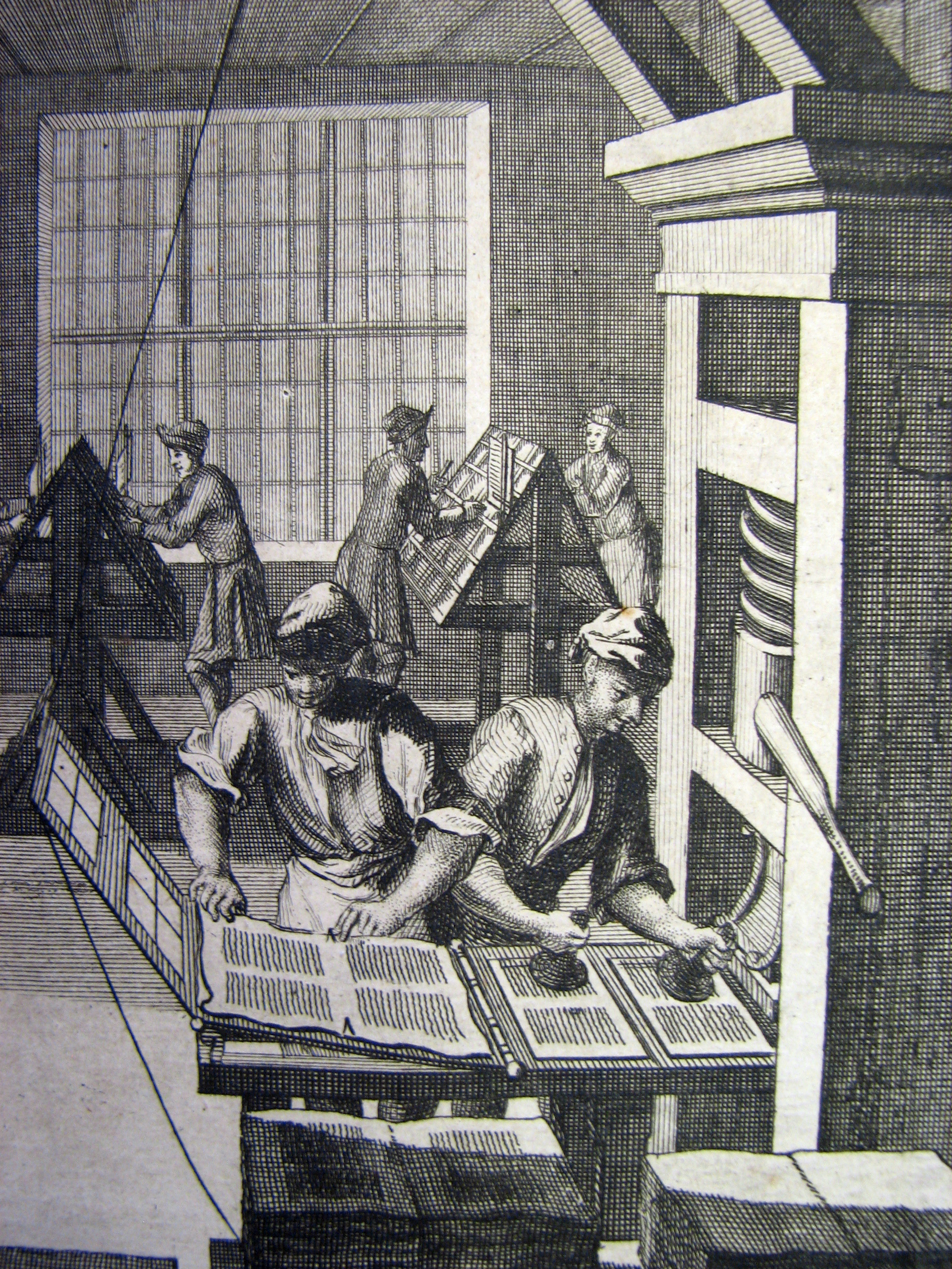
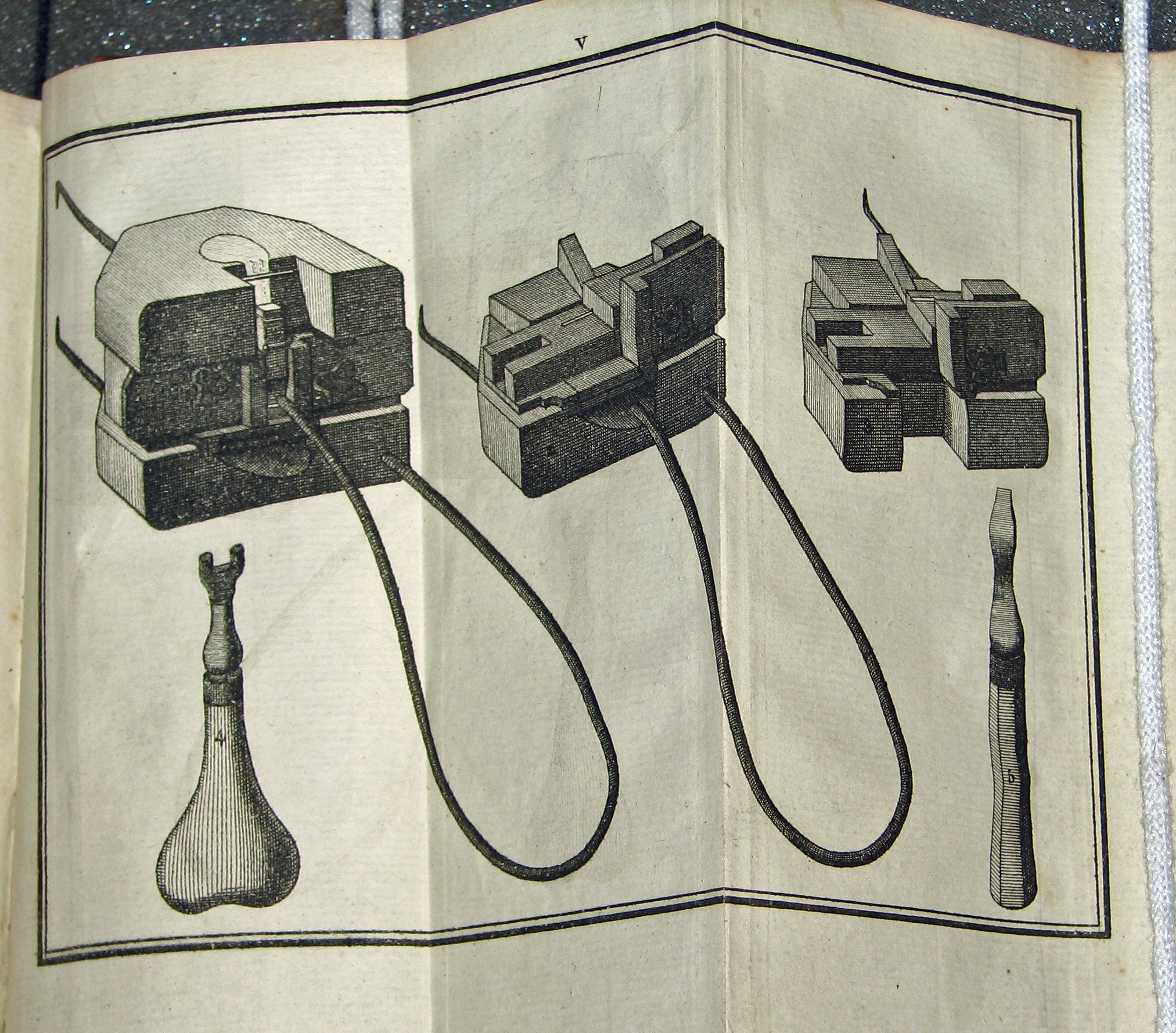
 72. Mechanick Exercises. (Joseph Moxon, 1683)
 73. Mechanick Exercises. (Joseph Moxon, 1683)
 74. Mechanick Exercises. (Joseph Moxon, 1683)
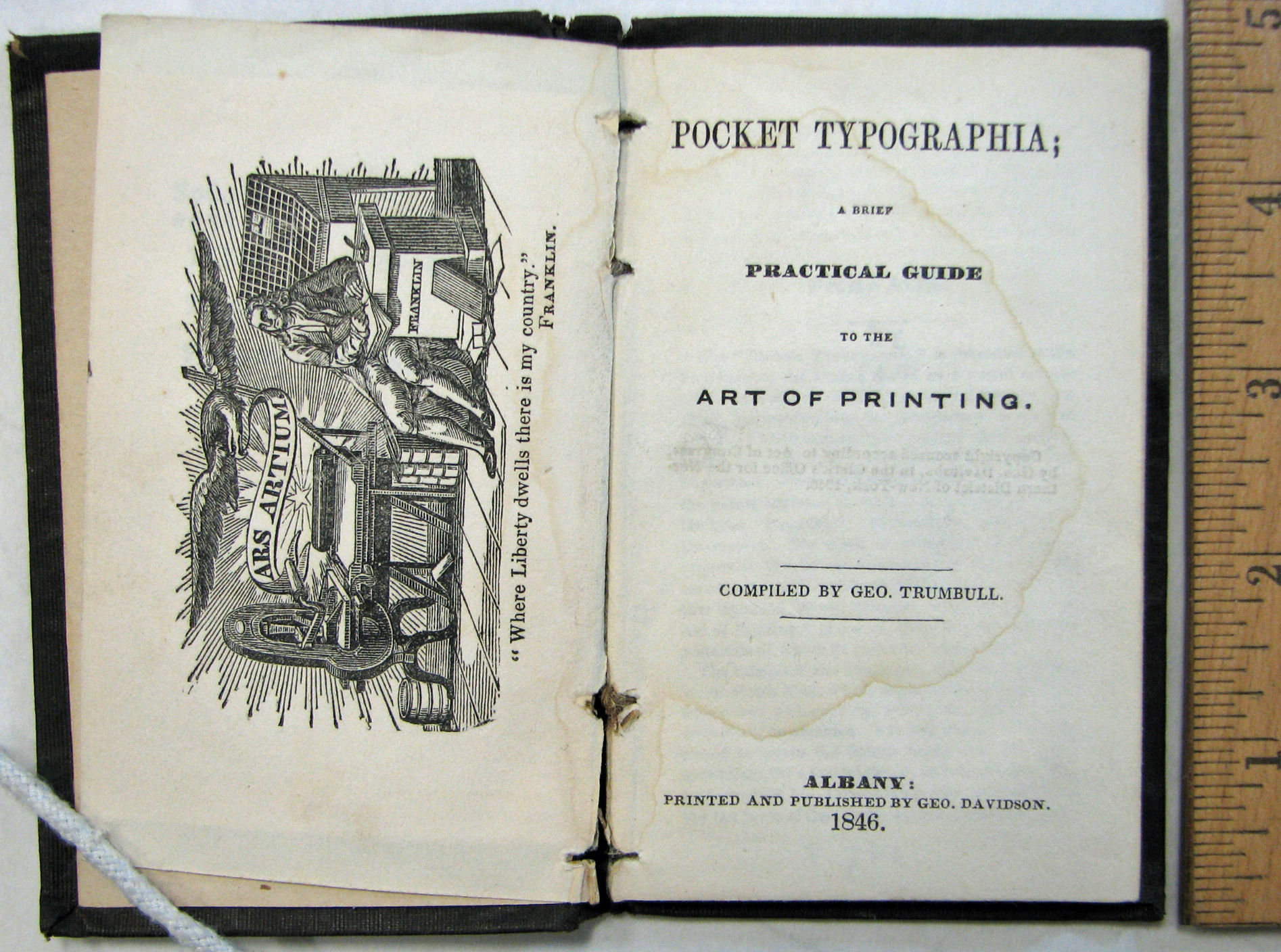 75. Pocket Typographia. (George Trumbull, 1846)
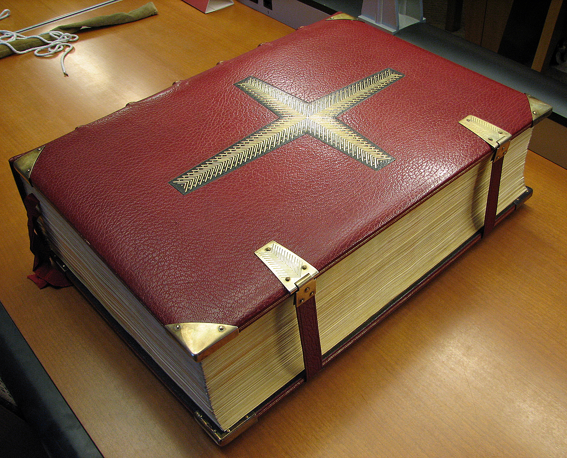 77. Oxford Lectern Bible. (Bruce Rogers, 1935)
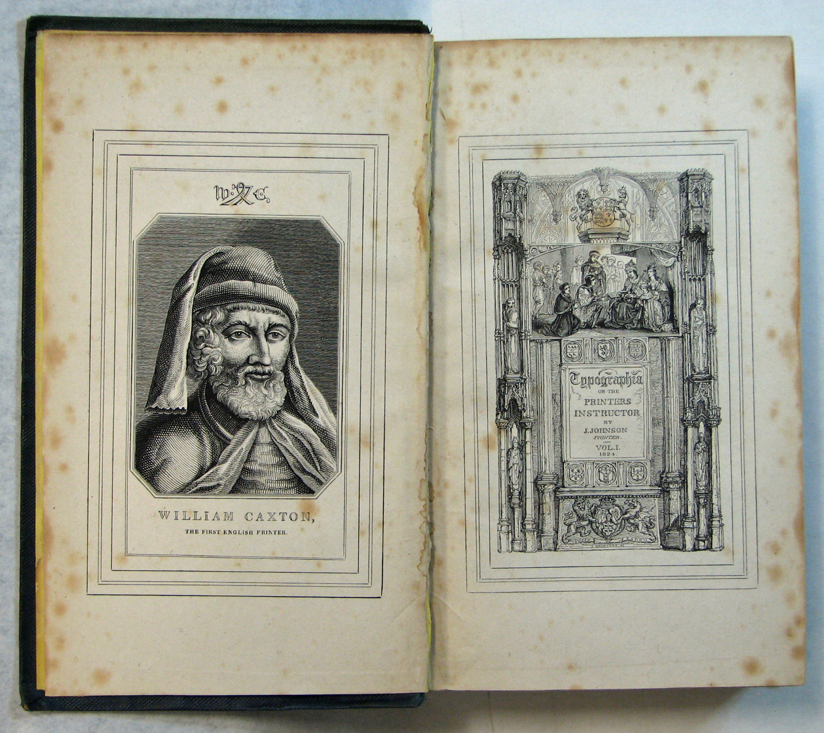 78. Typographia. (John Johnson, 1824)